From offer to funded account: modernizing digital account opening
Digital account opening now brings in nearly half of Truist’s new customers, and balances deposited through it more than doubled in two years. How every stage of the journey was rebuilt, over five years, as the market moved under it.
- Role
- Sr. Design Director
- Company
- Truist
- Year
- 2020–2026
The journey at a glance
Eight stages in customer order, with the year each was rebuilt. The band beneath is the arc of the work: confidence first, then friction out, then expansion, then scale.
- 1Discovery2026
- 2Shopping2026
- 3Start2023 · 2025
- 4Details2024
- 5Identity2024
- 6Funding2025
- 7Confirmation2025
- 8Assisted2023–2026
Overview
Digital account opening now brings in nearly half of Truist’s new customers, and balances deposited through it more than doubled in two years. This is the story of how the journey got there, stage by stage, across five years.
The scale: truist.com draws about 8M visitors a month and the bank approves more than 1M new accounts a year, from roughly four times that many applications started. Every stage of the journey, from the first search result to the first funded dollar, is a conversion decision at that volume.
I joined in 2020, during the BB&T and SunTrust merger, to build acquisition design as a function. Two legacy banks meant two sets of expectations, and a digital account opening experience that had to be made whole before it could be made better. Over the five years since, my organization grew to 30+ designers and researchers across four directors, and we rebuilt every stage of the journey at least once.
The market moved under us the whole time. In 2020 the question customers asked was whether they could open an account online at all. By 2023 fintechs had made minutes-long onboarding the norm. By 2025 instant funding and paycheck switching were table stakes. In 2026 the question is whether an AI answer engine or agent will find the product and open it on a customer’s behalf. Each stage below was rebuilt in response to one of those shifts.
The thesis: first make people willing to start, then make it effortless to finish, then make each new customer worth more, then make the whole system run without manual effort.
1. Discovery: meeting customers where they now shop
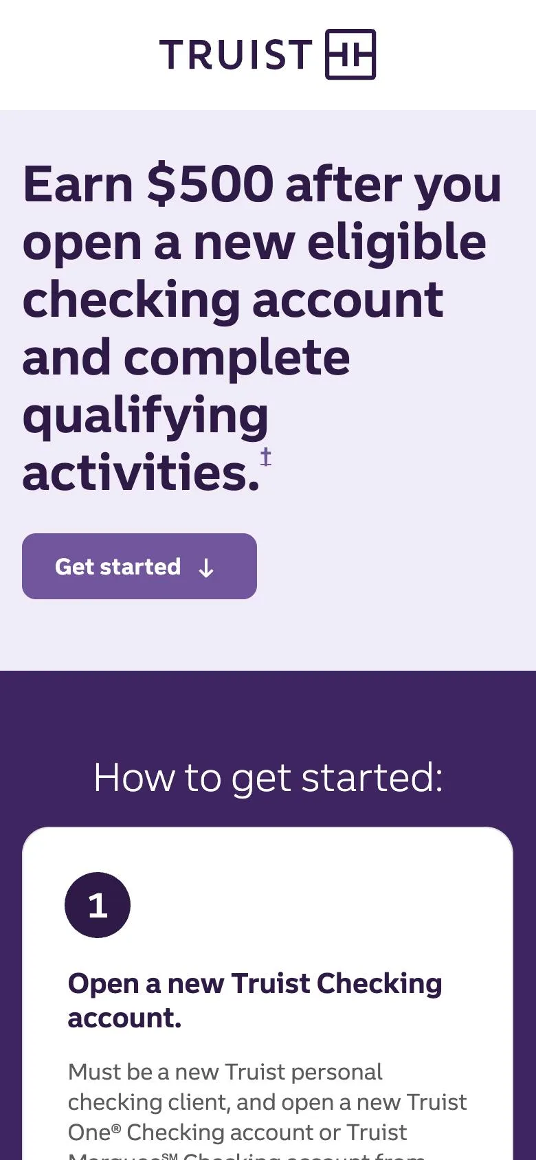
What changed. Promotional landing pages had been built as marketing assets — campaign-led, brand-forward, measured on impressions. We rebuilt them around conversion: each page is the first step of the application, with one clear path to start, the offer terms where a skeptical reader looks for them, and A/B testing as the default way to decide between layouts. In 2026 we extended the same thinking to how people find us, adding answer-engine optimization (AEO) alongside SEO so Truist products surface inside AI-generated answers.
What it delivered. Landing pages became a test-and-learn surface with a steady cadence of winning variants; AEO shipped as part of the 2025 roadmap design proposed and delivered in full.
2. Shopping: one offer journey instead of fifteen systems
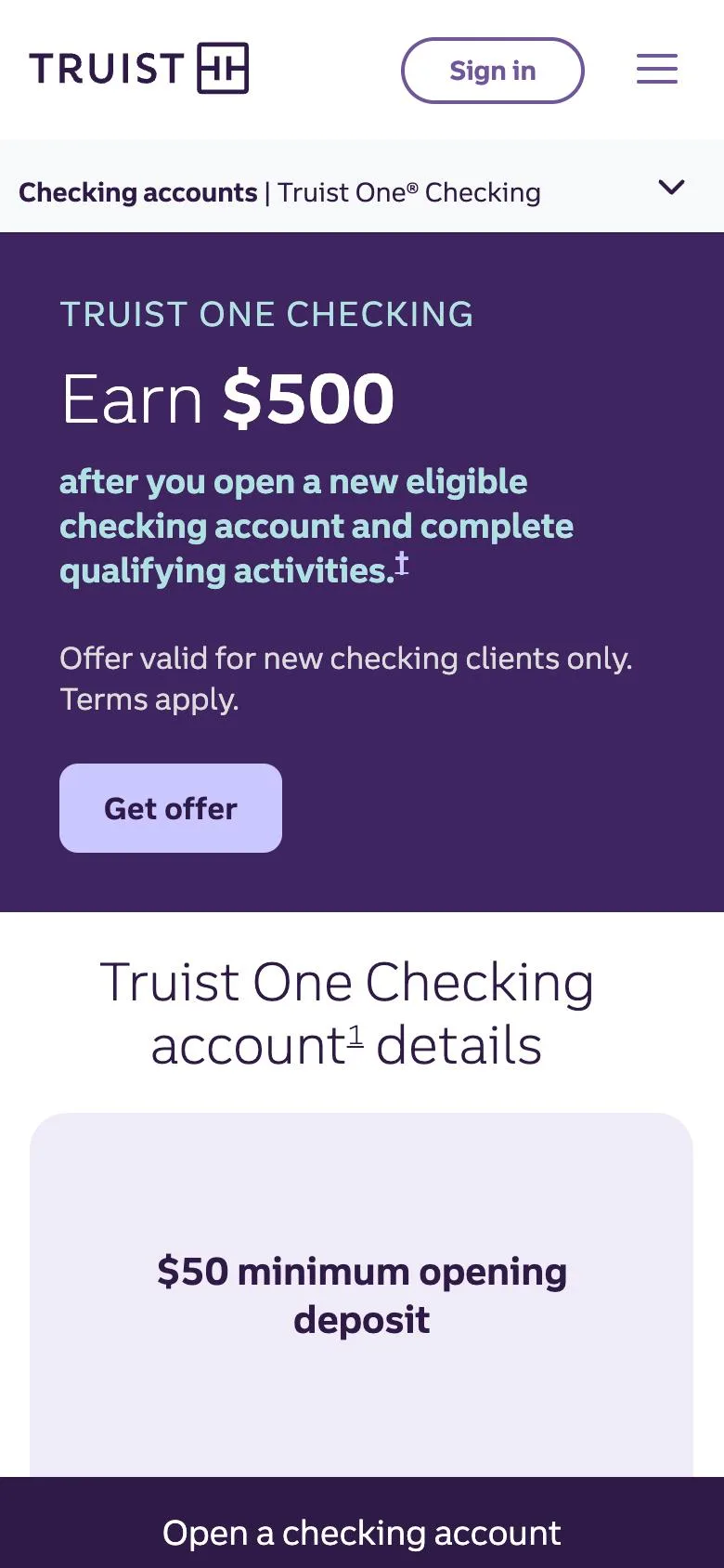
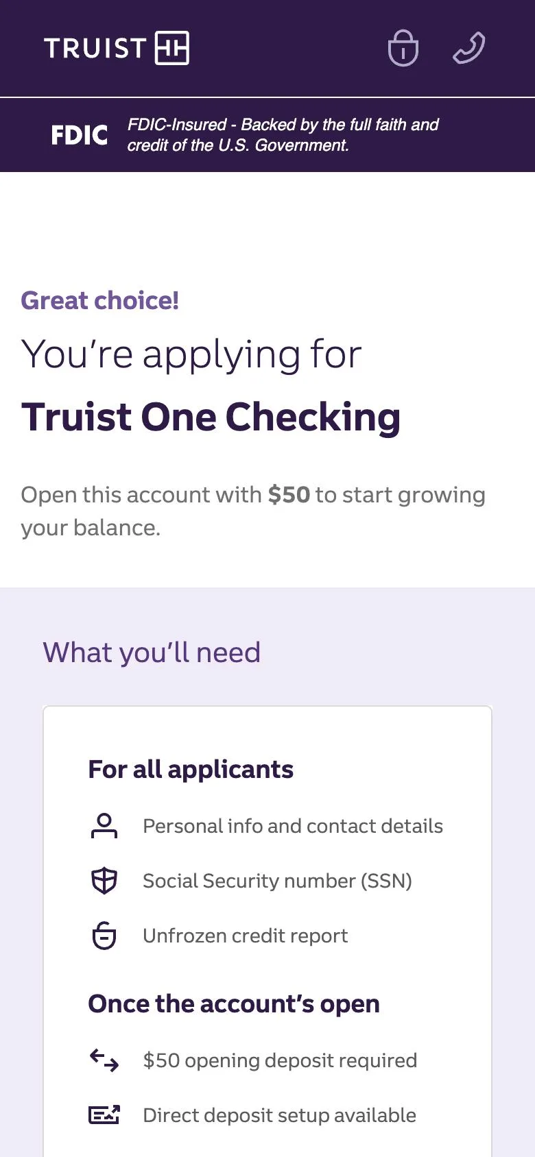
What changed. Product listing, compare, and the One Checking product pages now recognize who is shopping: prospects and authenticated clients see different offers, proof, and next steps. In 2026 we delivered the first promotional-offer modernization — a manual process touching 15 systems, from offer setup to reward payout, became one automated journey, with offers surfaced, applied, tracked, and paid without hand-offs between platforms.
What it delivered. Application starts rose by more than half, completions nearly doubled, and conversions to funded accounts more than doubled. The manual cross-platform work that used to gate every new promotion is gone.
3. Start: earning the confidence to apply
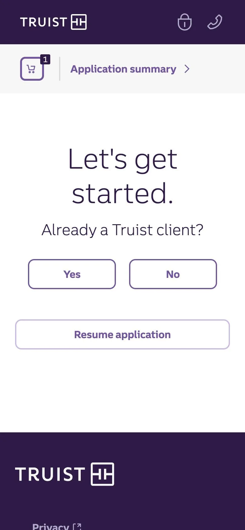
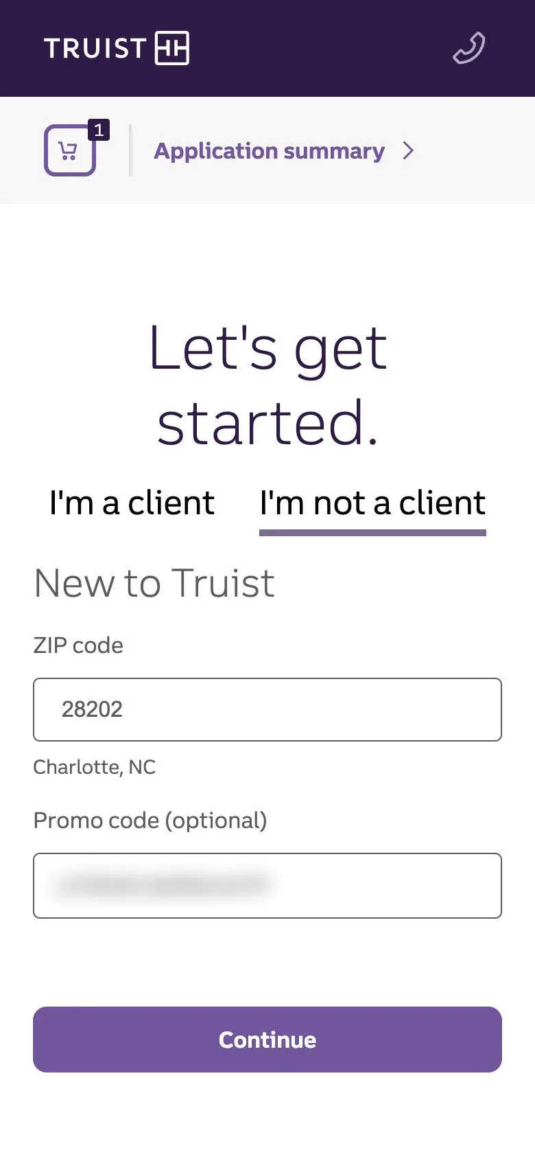
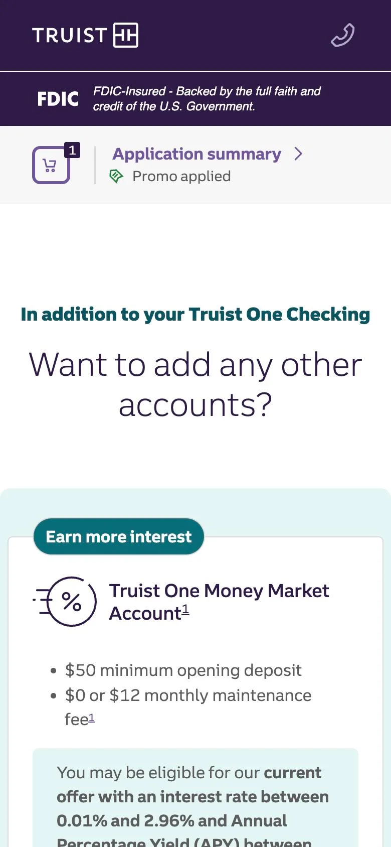
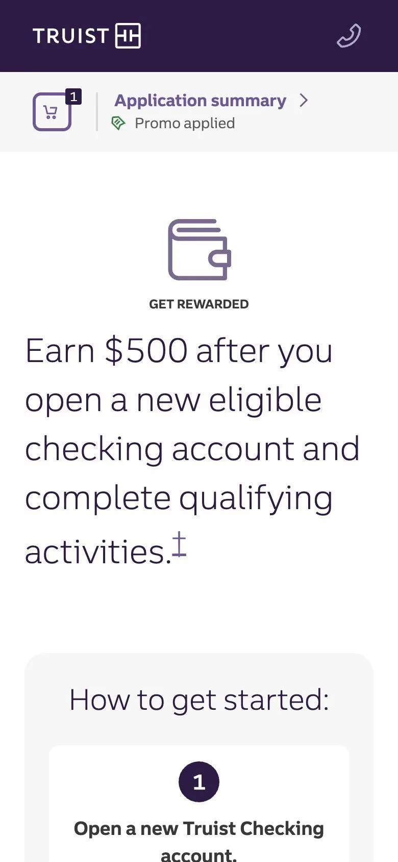
What changed. In 2023 we redesigned the start of the application around one question: what does someone need to know before they are willing to begin? Eligibility, what to have ready, how long it takes, and what happens to their information were rewritten and resequenced so the first screen builds confidence instead of testing it — and every change here moved the whole funnel below it. In 2025 we brought rates products (savings and CDs) into the same flow, so a customer opening checking can add one without starting over, and modernized small business account opening in the same period.
What it delivered. The modernized small business account opening ran at roughly twice its plan. The start experience is now the control surface we use to shape who enters the funnel and with what intent.
4. Details: removing every reason to stop
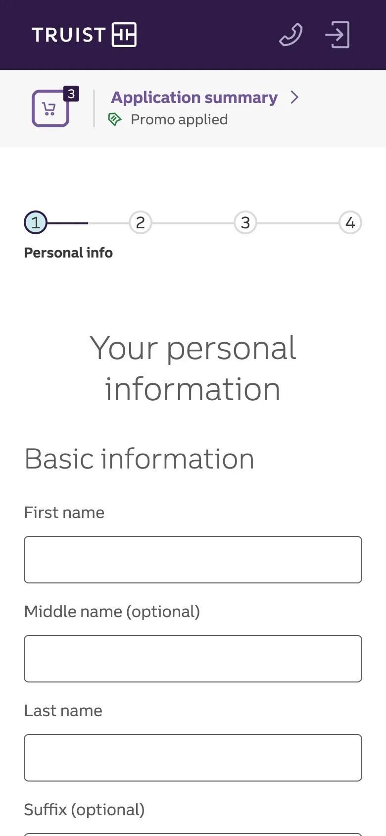
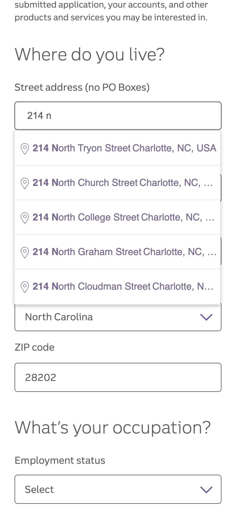
What changed. In 2024 we added address typeahead, cutting the slowest field in the form to a few keystrokes; removed fields that existed for process reasons rather than decision reasons; and rewrote the rest for clarity. We also redesigned the decisioning moment with a clearer loading state and progress messaging — behavioral data had shown applicants exiting by mistake while a decision was still in progress, because the screen gave them no reason to stay. This is the stage we iterate on most continuously.
What it delivered. Faster form completion, a measurable end to accidental exits at decisioning, and conversion improvements that contributed multi-million-dollar revenue.
5. Identity: verifying people the way they expect to be verified
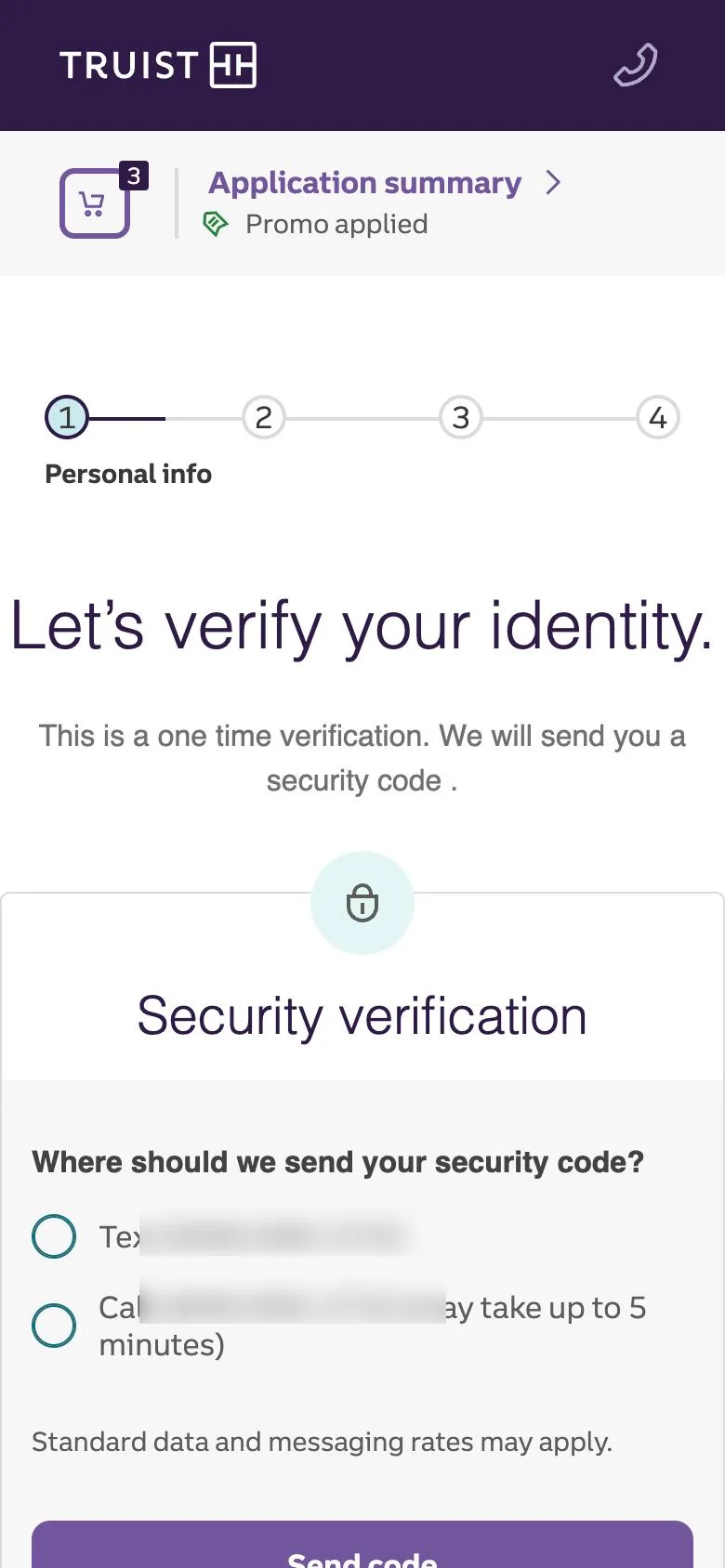
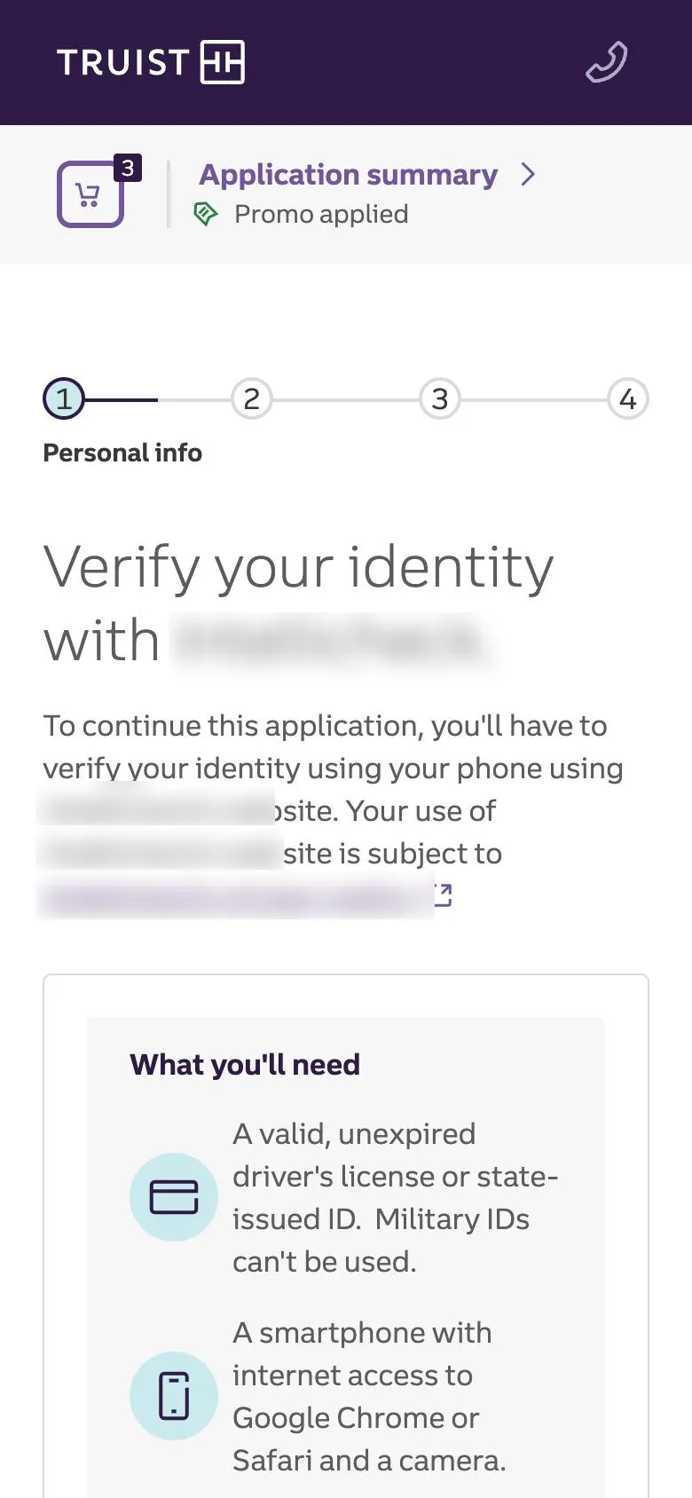
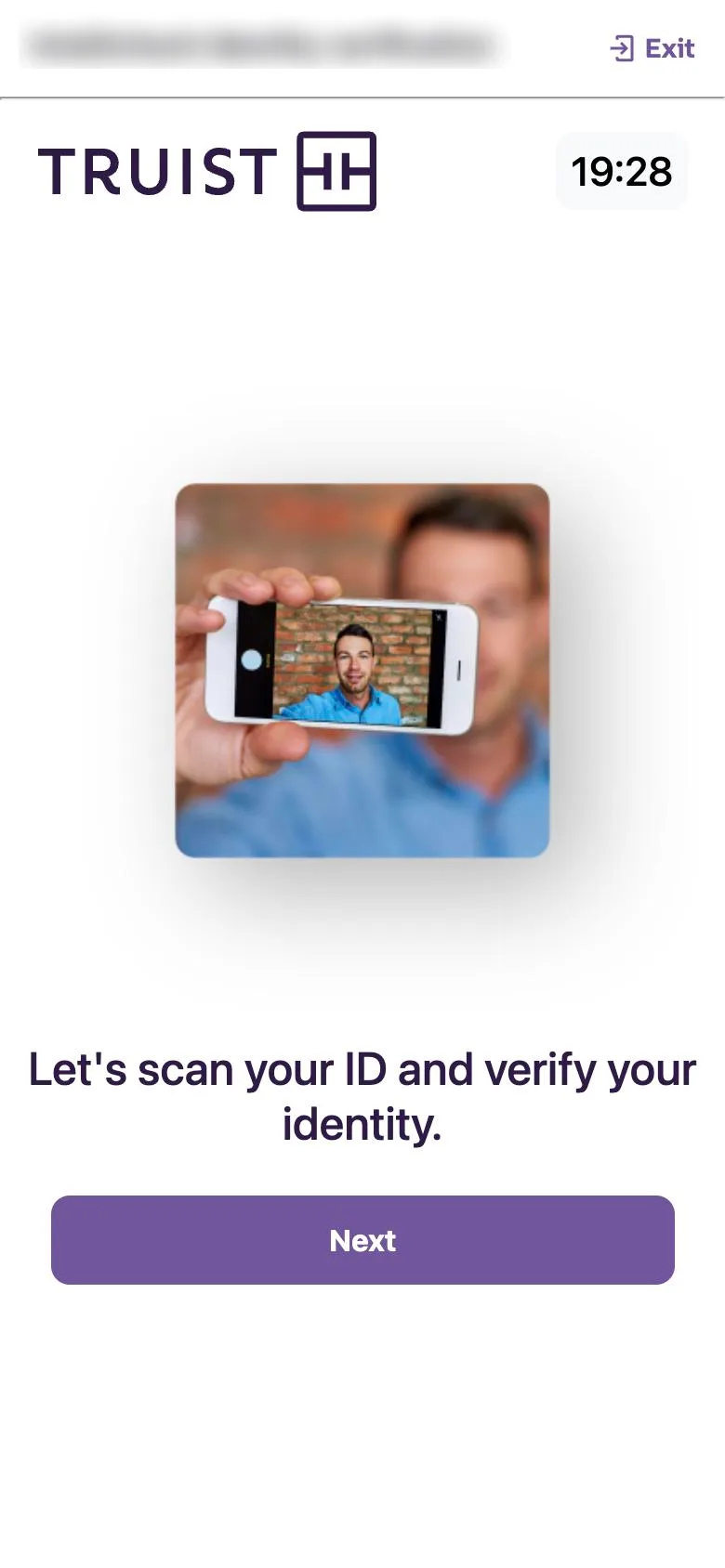
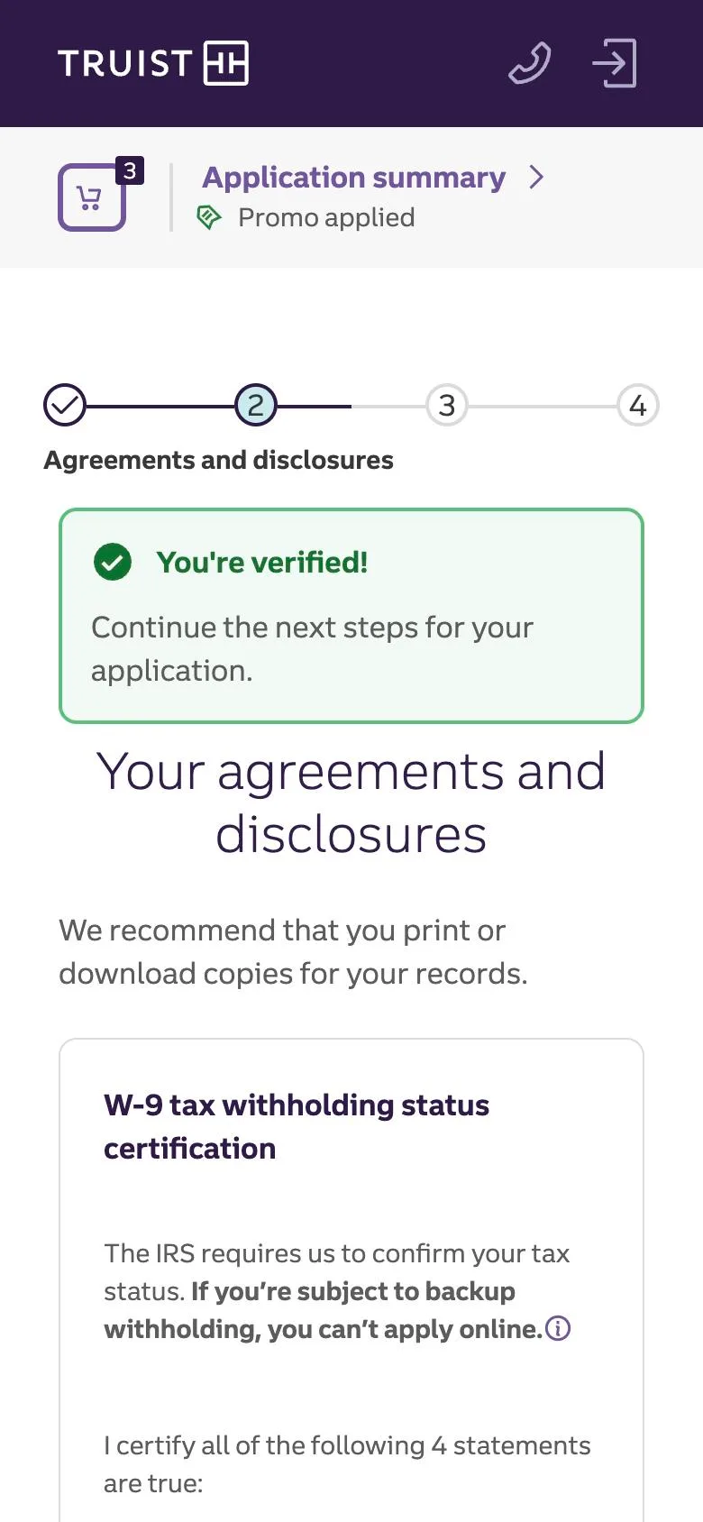
What changed. In 2024 we shipped a new identity-verification flow: instead of relying only on knowledge-based questions and back-office review, applicants verify with a government ID and a selfie in the moment. Built once and placed in the enterprise design system as a cross-platform library, the pattern now serves other scenarios and channels, and the authentication revamp that followed used the same foundation.
What it delivered. Conversion rose meaningfully for younger generations, the segment the old flow lost most. The new flow contributed to year-over-year growth of roughly a third in new digital customers and a multi-point lift in overall conversion.
6. Funding: turning an approved account into a funded one
What changed. An approved account that never gets funded is a cost, not a customer. In 2025 we redesigned funding so a customer can fund multiple accounts in one pass, from multiple sources, and added a direct deposit switch inside the journey so paycheck redirection happens while the customer is still motivated. In 2026 we moved funding to the point in the application where completion is most likely — a resequence design proposed from funnel data and delivered as part of the 2025 roadmap.
What it delivered. Three in four new checking and savings customers now fund within three months, up eight points. About one in five customers who engaged with paycheck switching moved their direct deposit. The funding experience, with account opening, sits behind the growth in deposited balances cited at the top of this study.
7. Decision and confirmation: the first day of the relationship
What changed. Confirmation used to be an end state: approved, here is your account number. In 2025 we redesigned it as the first day of the relationship — it now gets the new customer into the app and online banking before they leave, and surfaces lending and credit card offers at the moment they have just said yes to the bank. LightStream lending launched on truist.com and the homepage gained merchandising and personalization in the same period, so shopping and confirmation speak the same language about what else Truist can do.
8. Assisted channel: one journey, whoever is driving
What changed. Branch bankers and care center teammates had opened accounts in a tool that lagged the customer-facing one: fewer products, slower verification, no promotions, no funding options. Starting in 2023 we brought the assisted channel to parity, so a teammate can open the same products, apply the same offers, run the same identity verification, and fund the same way a customer can alone — assembled from the shared design system patterns rather than rebuilt.
What it delivered. One set of products, offers, verification, and funding, whether the customer or a teammate is at the keyboard. LightStream lending, extended earlier to branch and phone, proved the model.
What’s next
The next shift is already visible: customers asking an AI assistant which account to open, and agents that will shop and apply on their behalf. The AEO work at Discovery is the first response. The next is making every stage of the journey legible to an agent as well as a person: structured product data, machine-readable terms, and an application that can be driven without a human reading the screen.
Inside the team, AI-assisted design has already compressed testable concept generation from two weeks to one day. The funnel data, research practice, and design system built over these five years are what let the organization move at that speed inside a bank built to move carefully.
My role
I lead acquisition design at Truist: a 30+ person design and research organization across four directors covering public sites and marketing, direct-to-digital deposits and lending, teammate-assisted channels, and cross-platform capabilities. I own customer insights and experience strategy for the funnel, the hiring bar, and the vendor budget, and I work daily with the heads of Performance Marketing, Digital Capabilities, and Cybersecurity.
On this work specifically: I built the org that did it, brought customer-behavior analytics into the organization and built the funnels that tied design decisions to deposit outcomes, and used that data to make design the function that proposes the roadmap. In 2025 design proposed and won 40 roadmap items and delivered all of them, including the authentication revamp, the funding resequence, and AEO. Every director who led a stage above was grown from within.