← All work

Reinventing a hospice platform around what matters most

First UX/UI design hire at a 25-year-old hospice-software company reinventing itself as a modern SaaS — I set the experience strategy with the C-suite around “what matters most” in end-of-life care, and built the prototype that sold it at hospice conferences across the country.

Role
UX/UI Designer (first design hire)
Company
mumms Software
Year
2014

Context

mumms Software had built hospice-care technology in New Orleans for 25 years. By 2014 the company was reinventing itself as a modern SaaS business, and Hummingbird was the bet: one platform in place of separate tools for clinical documentation, hospice operations, billing, and reporting. I joined as the company’s first UX/UI design hire.

Problem

Legacy hospice software is organized around billing and compliance, not the visit. A nurse or physician at the bedside worked through screens arranged by what the system needed to capture, and the patient’s own experience — pain, breath, appetite, fear — was scattered across them. The company’s sales story had the same shape: a list of modules, not a point of view on care.

Approach

Start every visit with the question that matters most. I advised the executive team on an experience strategy built on “what matters most” in end-of-life patient care. Every nurse or physician visit opens by asking the patient about the thing that matters most to them right now, scored from 1 to 10 — pain, constipation, shortness of breath — so the record, the care plan, and the team’s attention all start from the patient’s own words. That one principle organized the product: patient note, care plan, interdisciplinary review, and reporting all hang off it.

Design from the bedside outward. I worked from how hospice nurses, physicians, chaplains, and social workers actually run a day — pre-visit prep, the visit, the interdisciplinary group meeting — and shaped the information architecture and screen flows for the whole platform around those moments.

Prototype to sell, before building to ship. With engineering still on the legacy product, I built a clickable prototype of the new Hummingbird experience that the company could put in front of hospice agencies at major conferences across the country.
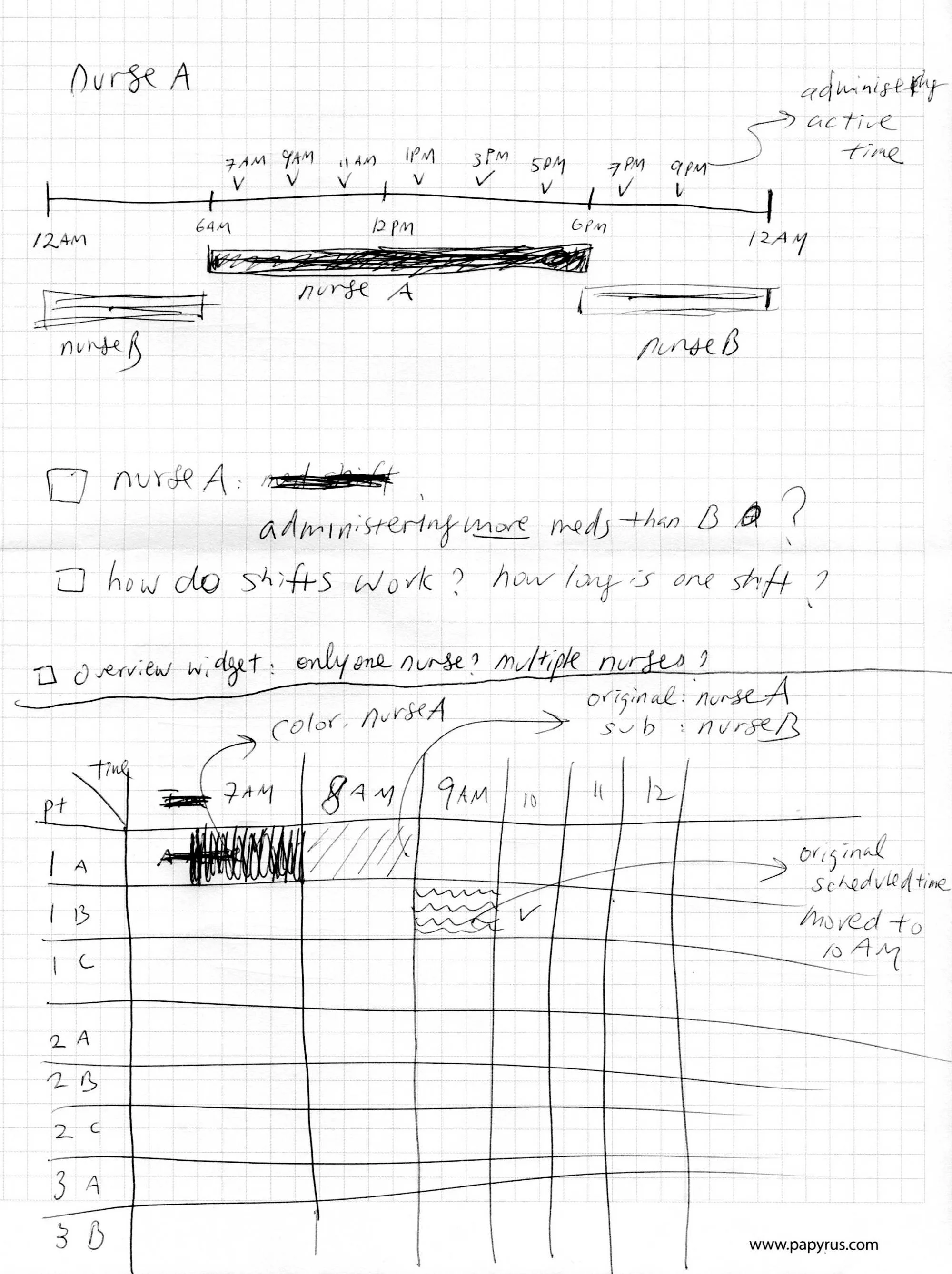
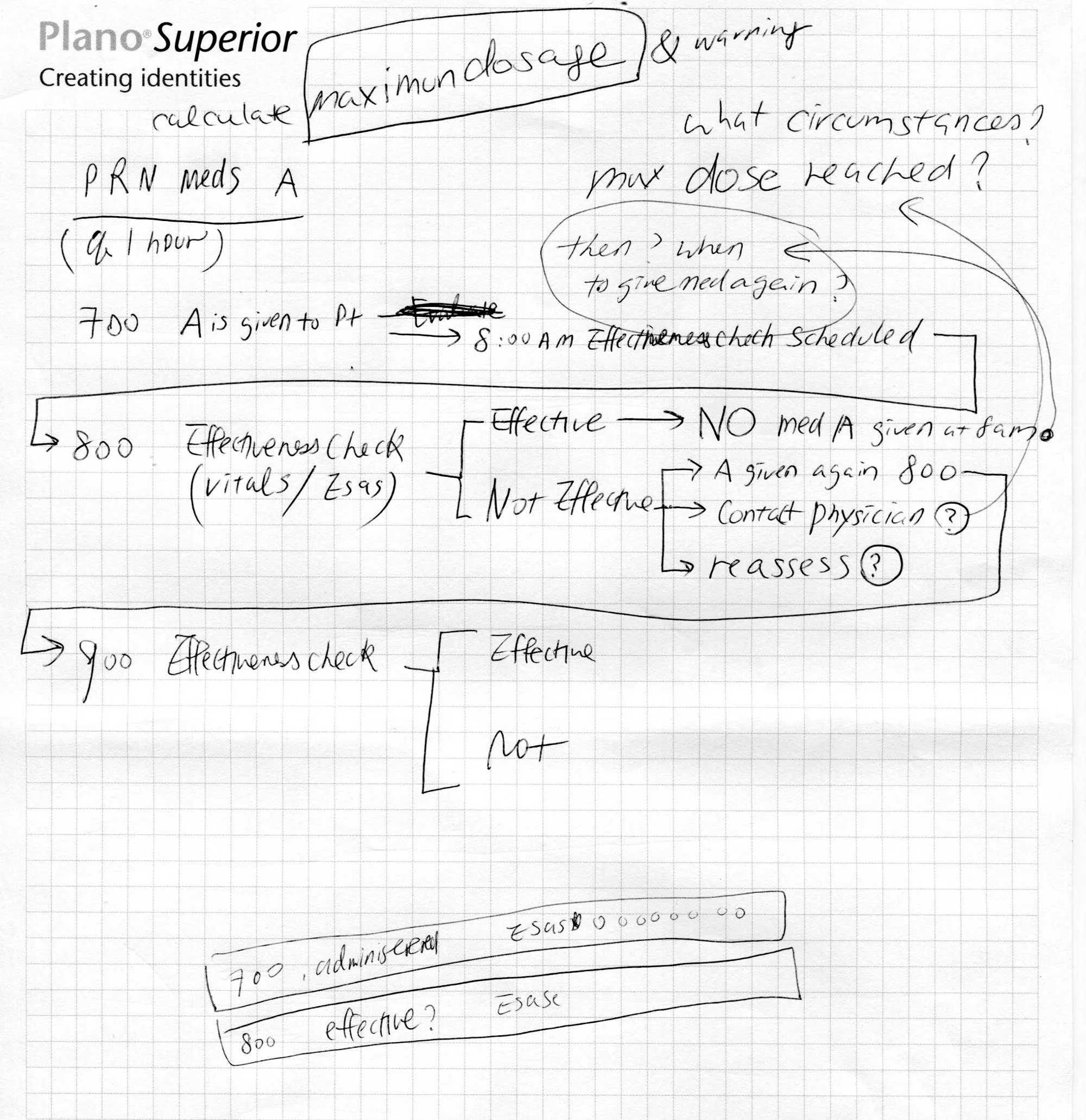
Pen sketch on grid paper working out how two nurses’ shifts overlap across a 24-hour timeline and how a medication administered by one nurse appears to the other.Pen sketch working out as-needed medication logic: when a maximum dose is reached, when an effectiveness check happens, and what the nurse does if the medication was not effective.
Working it out on paper with the clinical team: how shifts hand off, and what happens after an as-needed dose — maximum dose reached, effectiveness check, not effective, contact the physician.
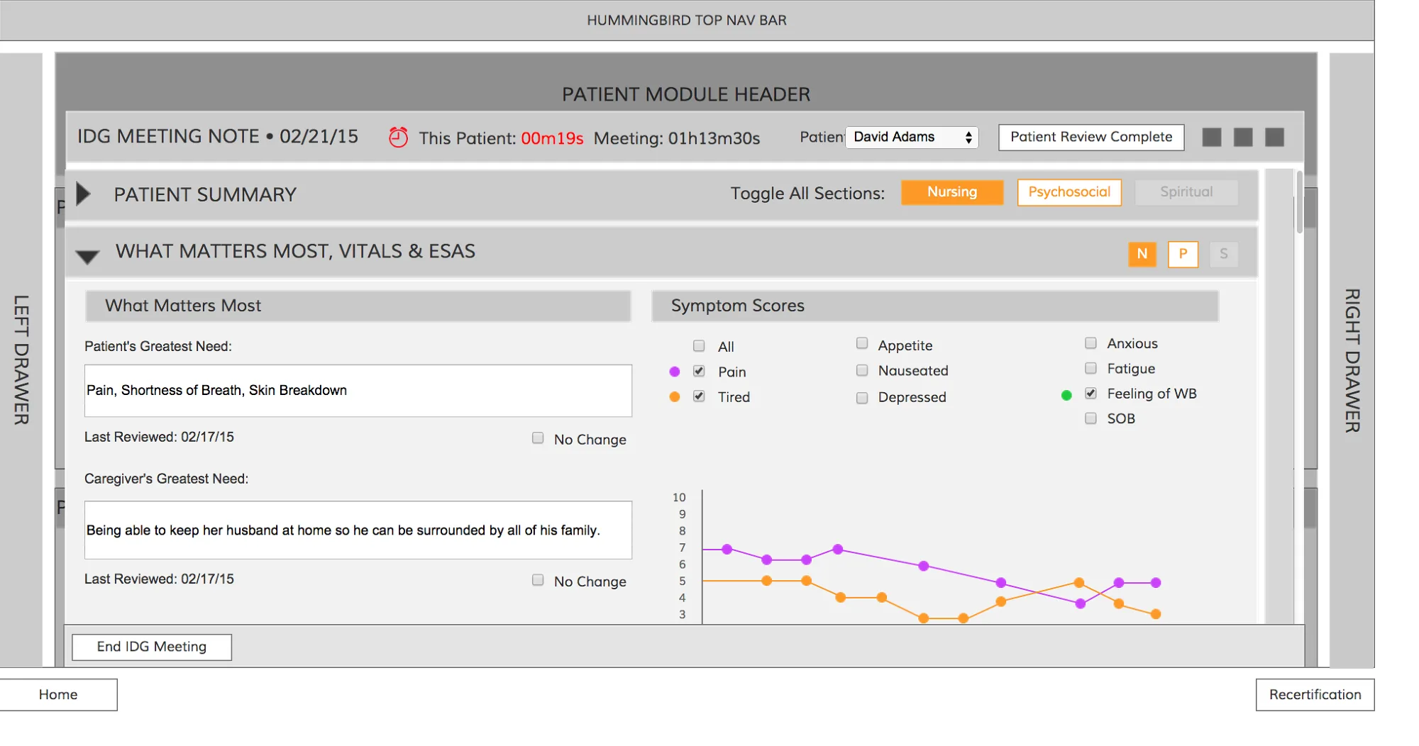
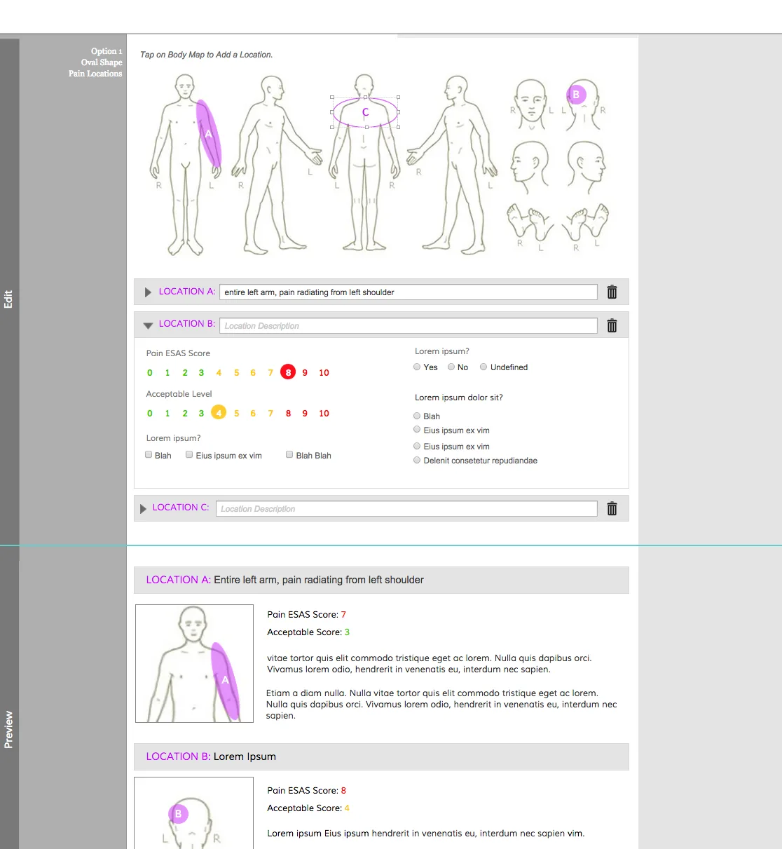
Greyscale wireframe of an interdisciplinary group meeting note with a What Matters Most, Vitals and ESAS section: the patient’s and caregiver’s greatest need, 0–10 symptom scores, and a small trend chart.Greyscale wireframe of a body map for locating pain: front and back figures with a highlighted region on the left arm, a 0–10 pain score, and fields describing the location.
Wireframes before visual design: the “what matters most” block in the team meeting note, and a body map so a nurse can show where it hurts instead of only typing it.

What we shipped

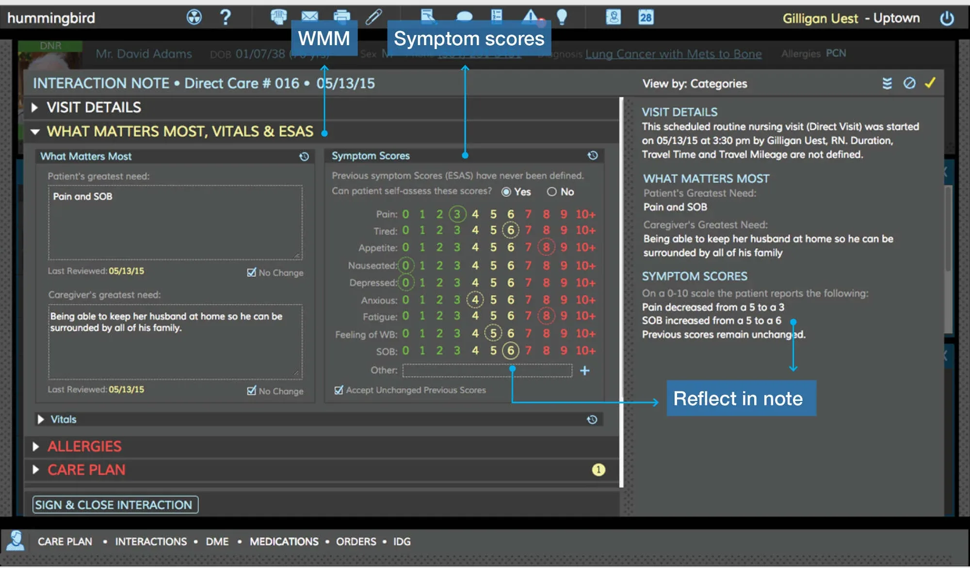
Hummingbird interaction note for a nursing visit. A What Matters Most panel records the patient’s greatest need, Pain and SOB, and the caregiver’s greatest need; beside it a Symptom Scores panel scores pain, tiredness, appetite, nausea, anxiety, fatigue, well-being and shortness of breath from 0 to 10, and a narrative note on the right reflects the scores in plain language.
The visit note. “What matters most” and the 0–10 symptom scores come first; the narrative on the right writes itself from them — pain down from 5 to 3, shortness of breath up from 5 to 6 — so charting serves the conversation instead of replacing it.
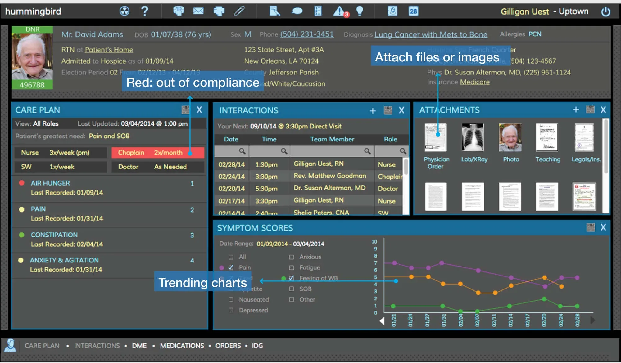
Hummingbird patient overview: a header with the patient’s photo, diagnosis and hospice election period; panels for the care plan with greatest need listed first, scheduled team interactions by nurse, chaplain, doctor and social worker, attached files, and a Symptom Scores chart trending pain, fatigue and well-being over two months.
Patient overview. The greatest need sits at the top of the care plan, the whole interdisciplinary team’s visits are in one timeline, and symptom scores trend over time so the team can see whether care is working.
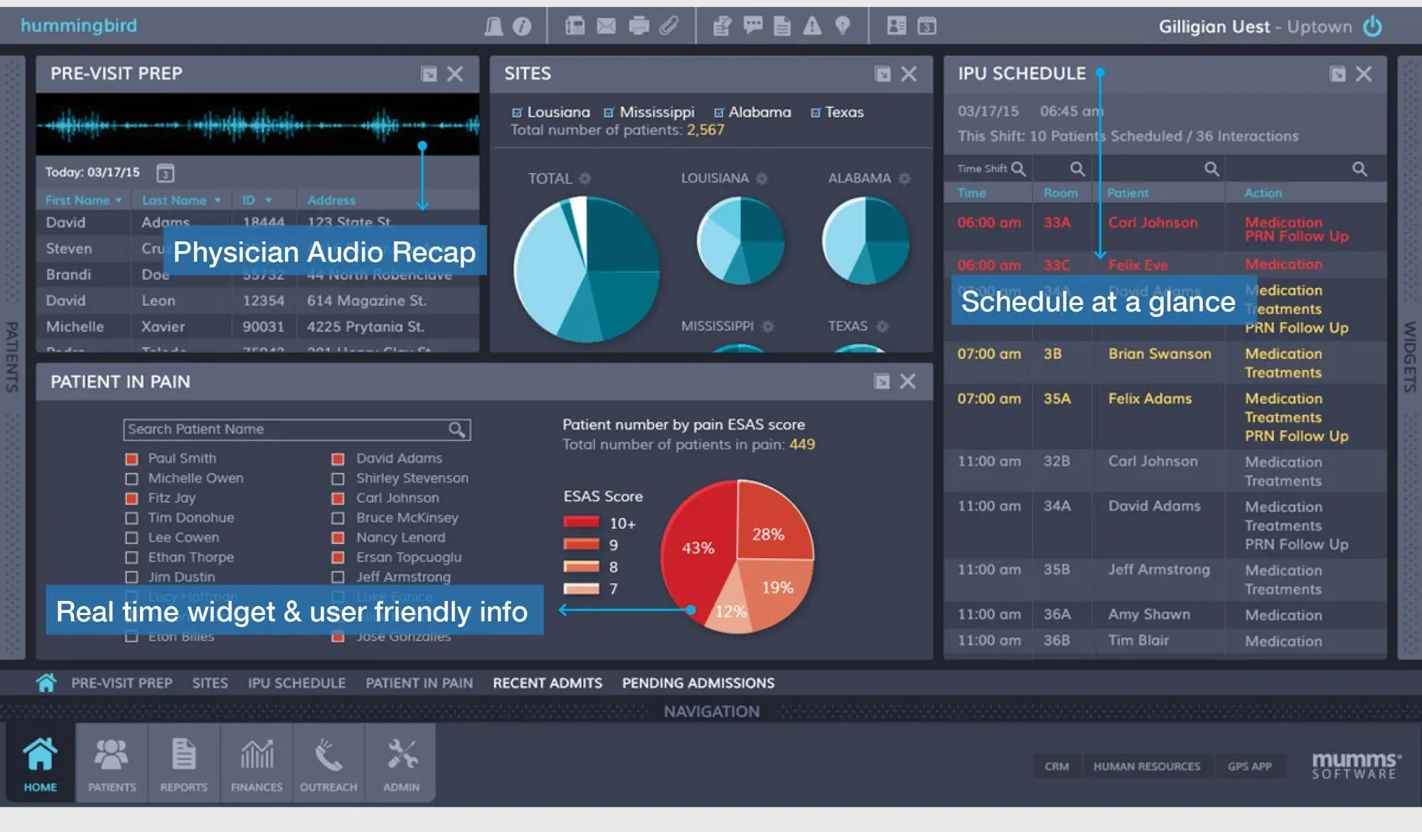
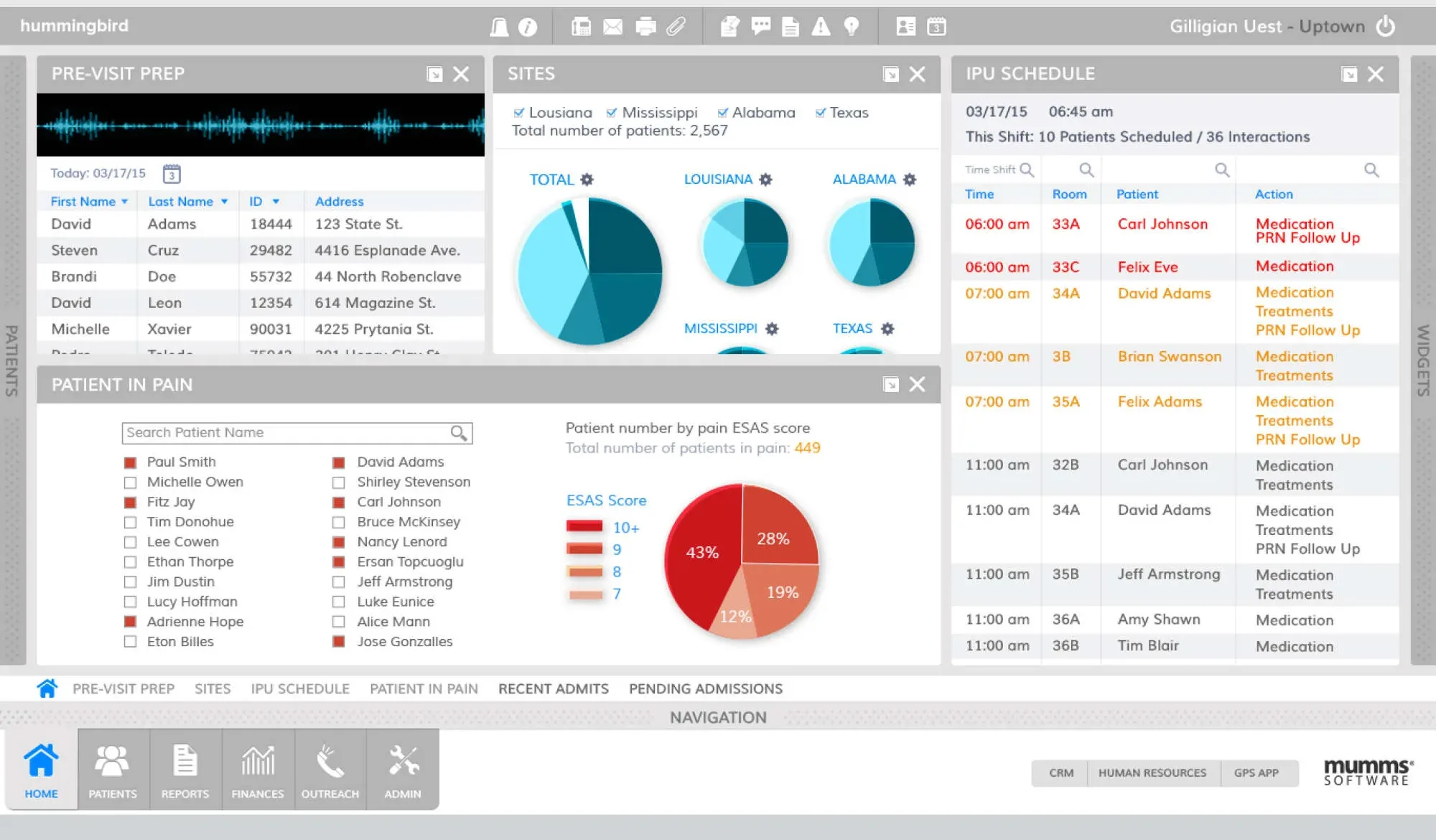
Hummingbird clinical dashboard: pre-visit prep with a physician audio recap, patient counts by site shown as pie charts, an inpatient-unit schedule for the shift, and a Patient in Pain widget listing patients by pain score with a chart of 449 patients in pain.
Clinical dashboard for the start of a shift: who is in pain across every site, today’s visits, and a physician’s audio recap for pre-visit prep.
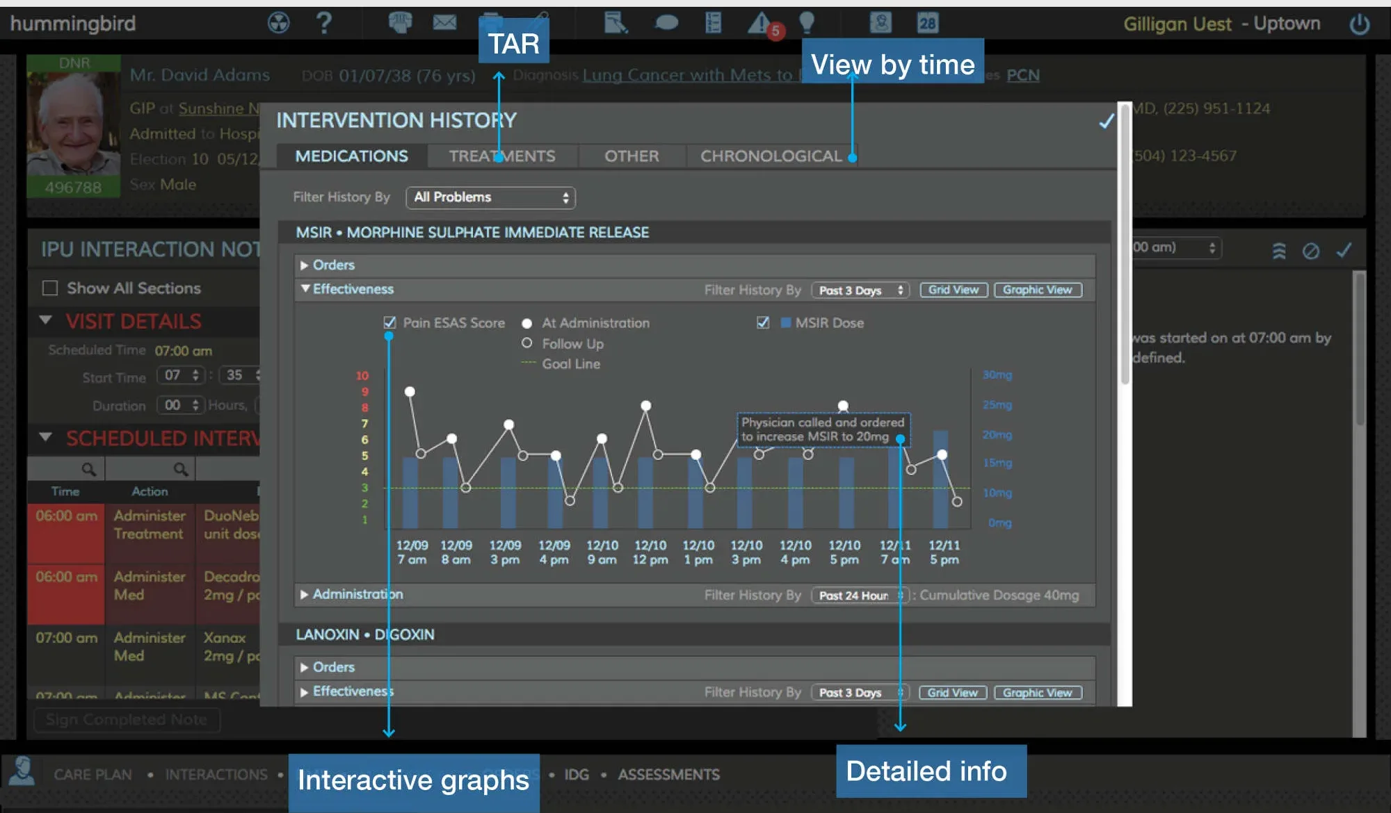
Hummingbird medication effectiveness view: an intervention history for morphine sulphate plotting the patient’s pain score against each administered dose over three days, with a note where the physician ordered an increase.
Medication effectiveness. Pain scores plotted against every dose, so a nurse can see at a glance whether the morphine is working and when the physician changed the order.
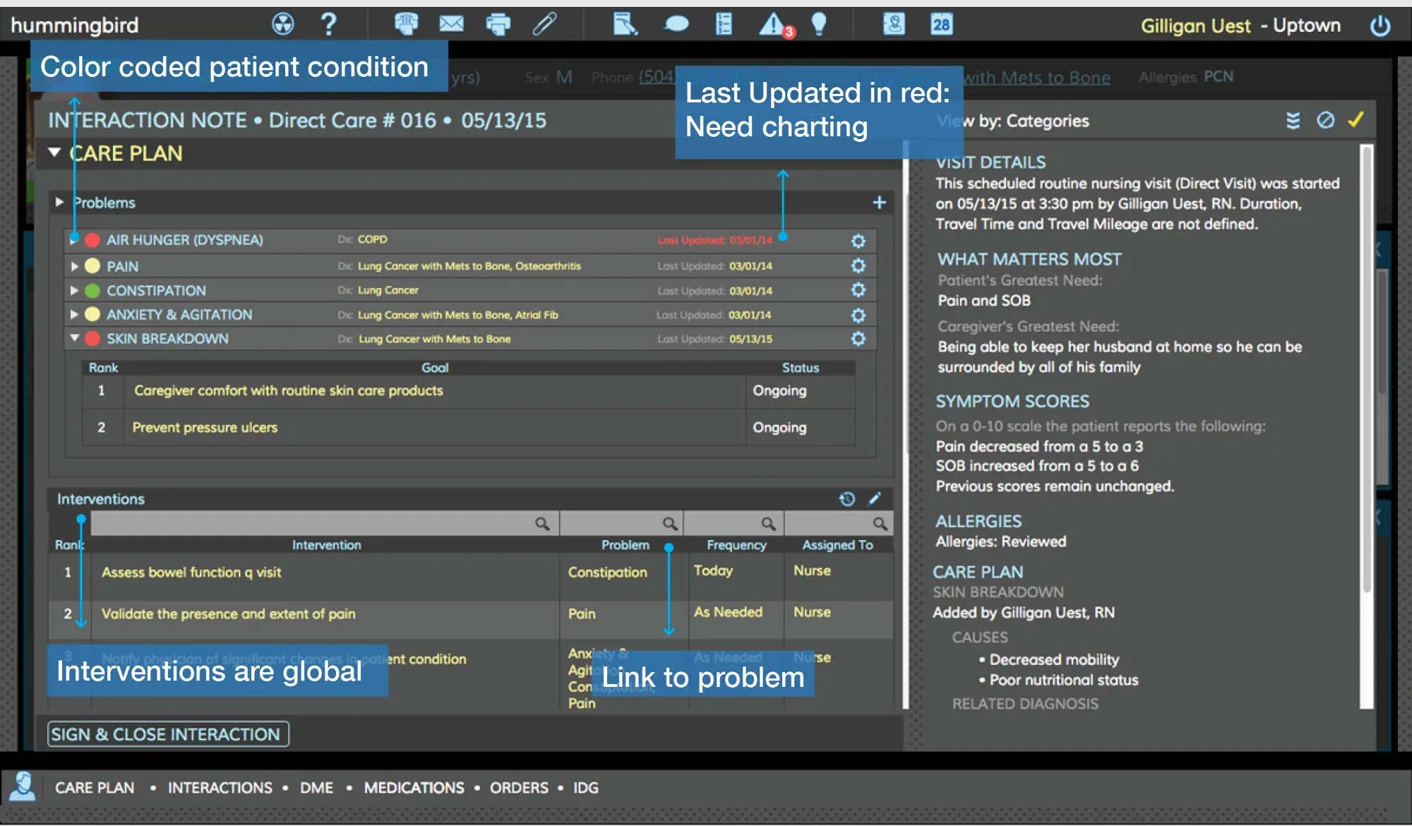
Hummingbird care plan: problems such as pain, constipation and skin breakdown listed with color-coded status, interventions assigned to team members, and a last-updated date shown in red when charting is overdue.
Care plan. Problems are color-coded by condition, every intervention links back to the problem it addresses, and anything overdue for charting turns red.
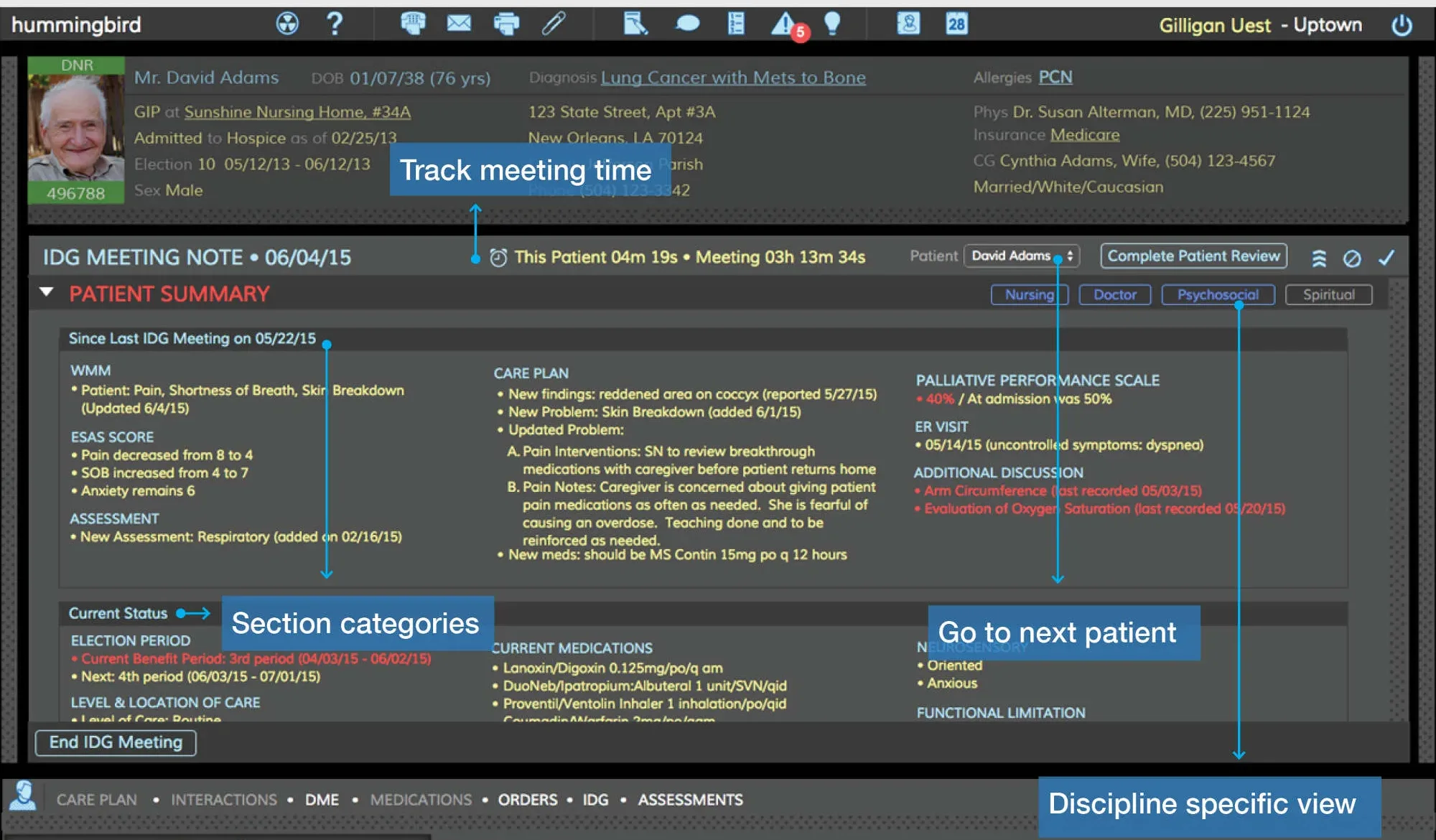
Hummingbird interdisciplinary group patient review: a patient summary organized by what matters most, care plan, palliative performance scale and discipline-specific sections, with a meeting timer and a button to go to the next patient.
The interdisciplinary group meeting, where the whole team reviews each patient. The summary opens with what matters most, each discipline has its own view, and a timer keeps a long meeting moving.
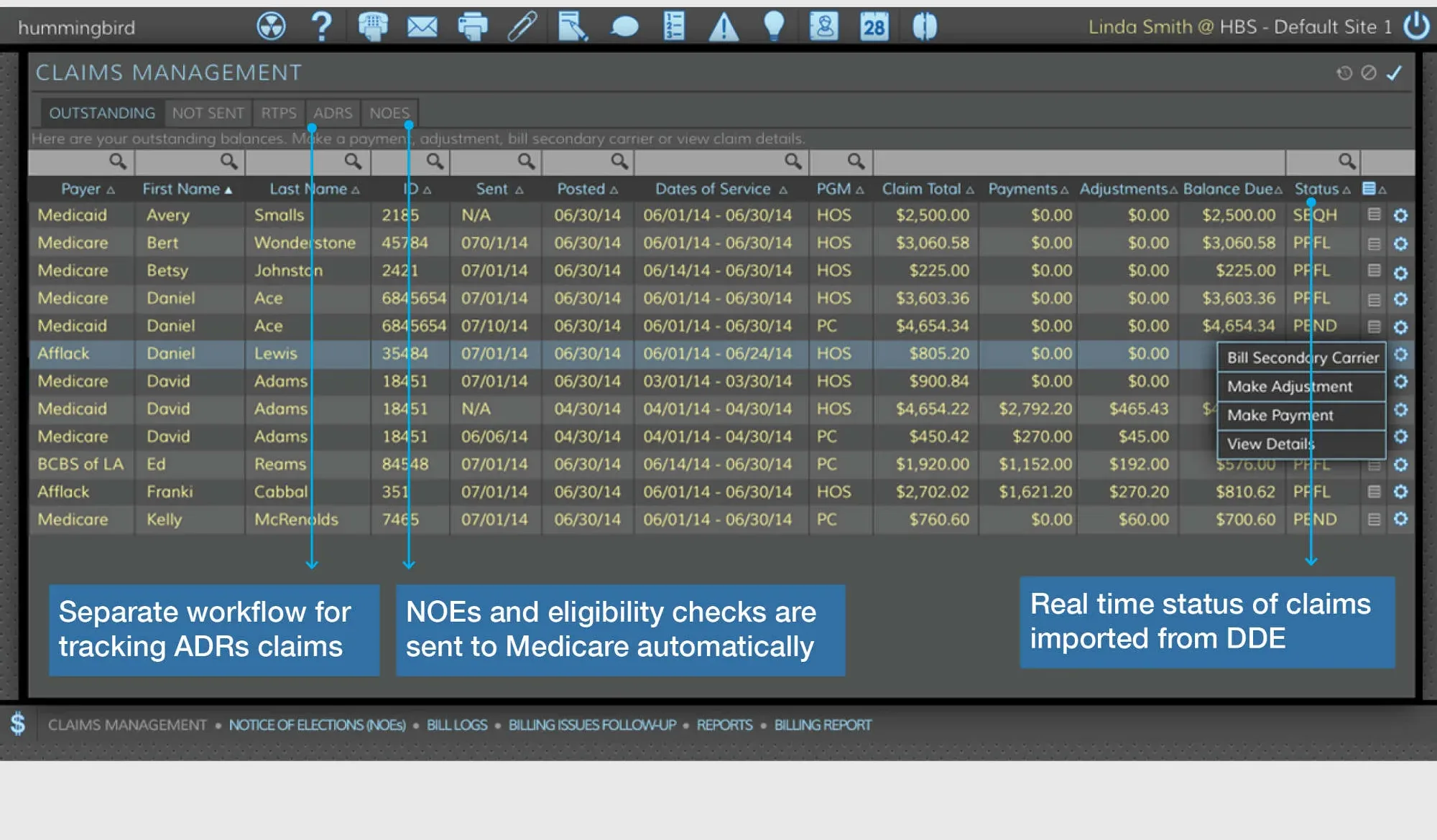
Hummingbird claims management table listing Medicare and Medicaid claims by patient with claim totals, payments, balances and status, a row menu to bill a secondary carrier or make an adjustment, and callouts noting that notices of election and eligibility checks are sent to Medicare automatically.
The business side, in the same system. Claims, notices of election, and eligibility checks run alongside clinical work rather than in a separate billing product.

More of the platform

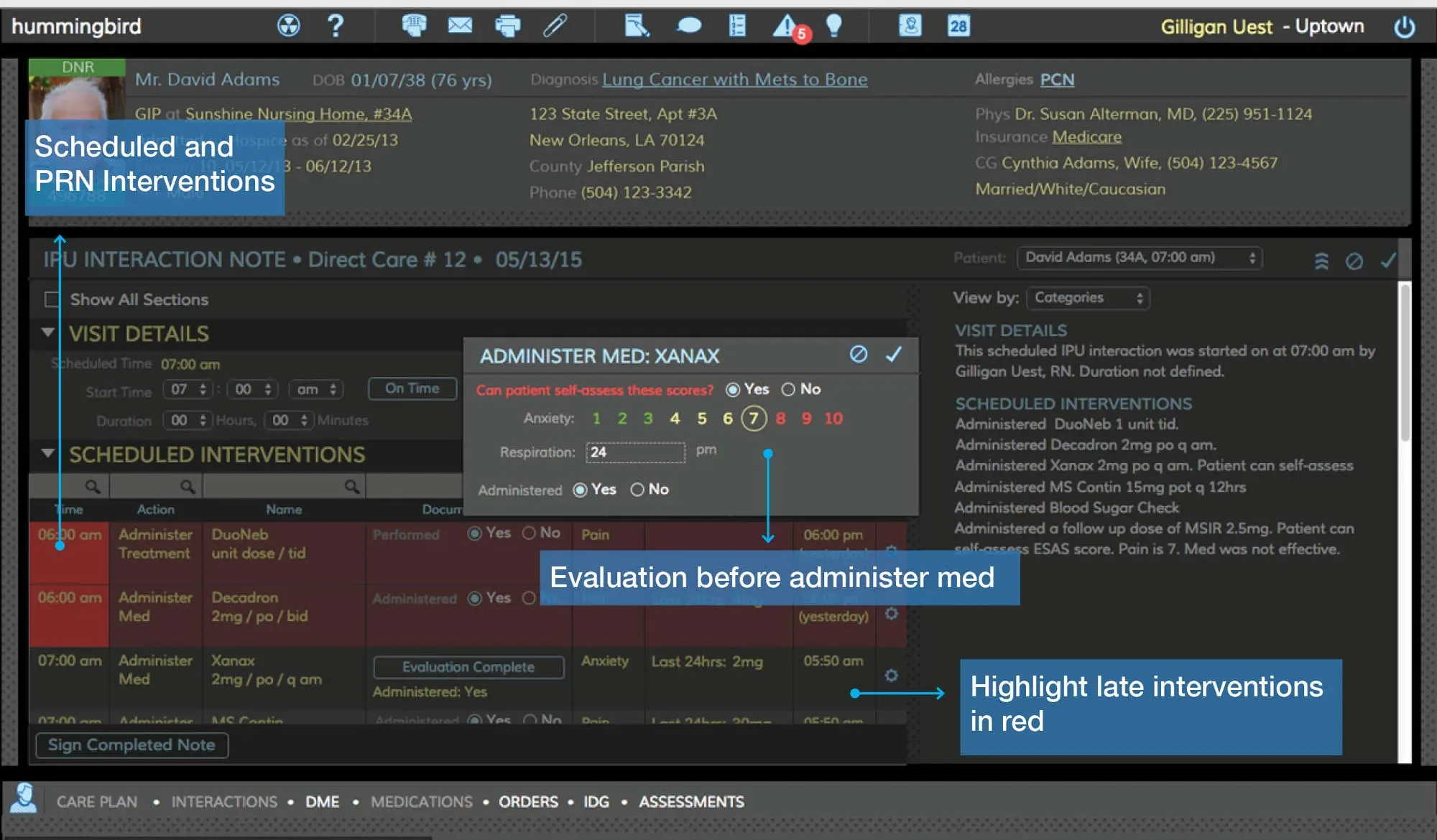
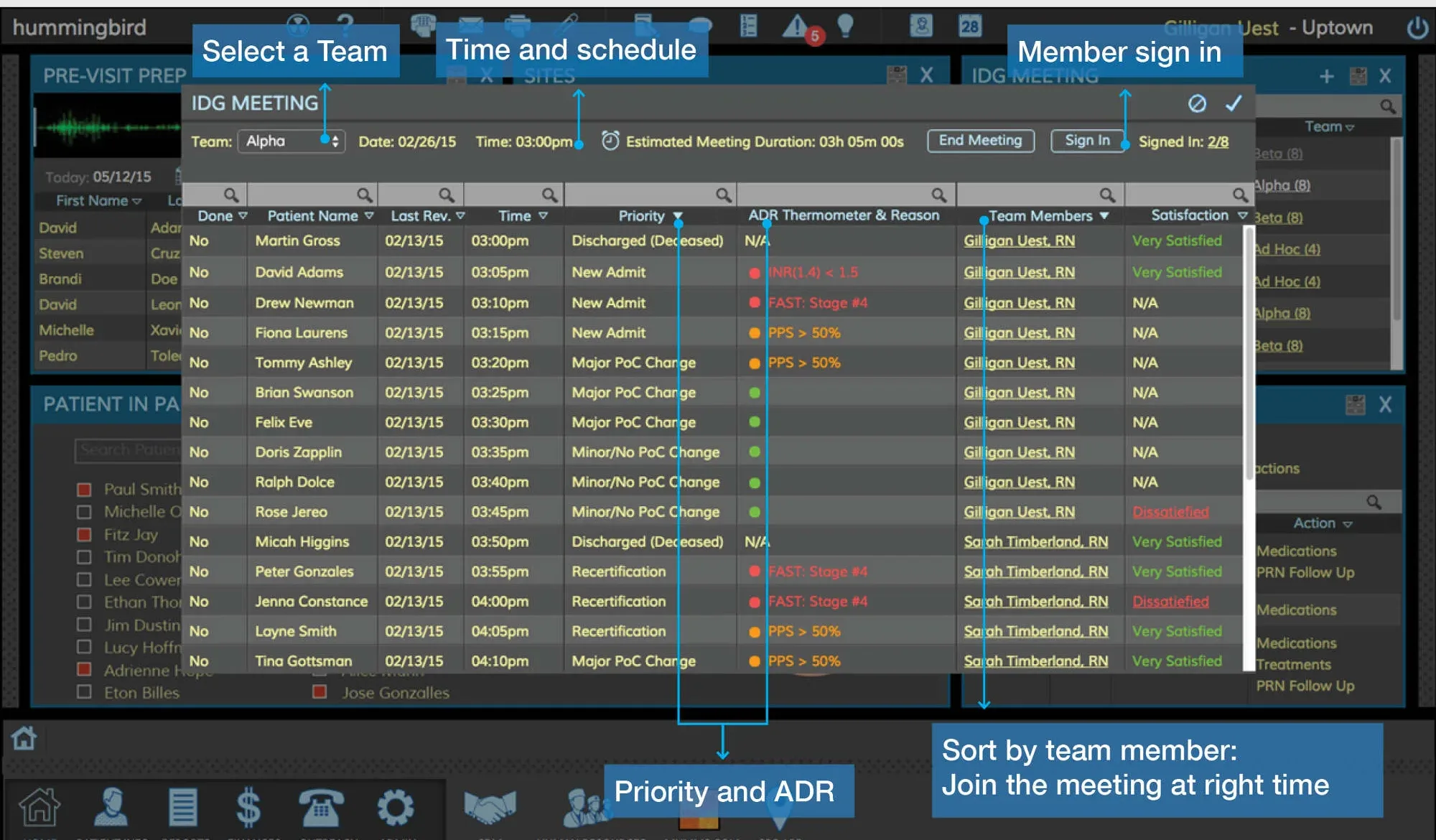
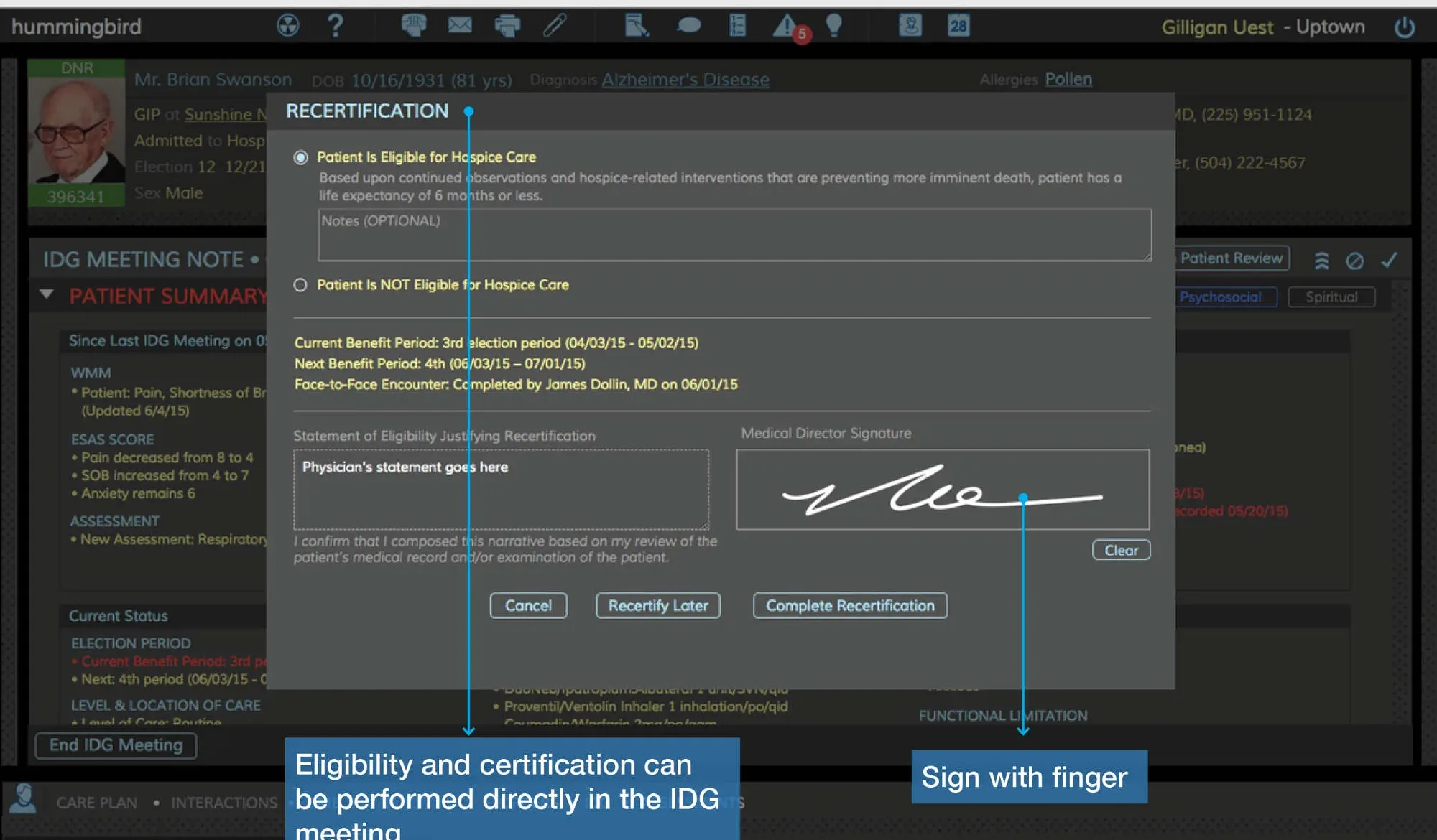
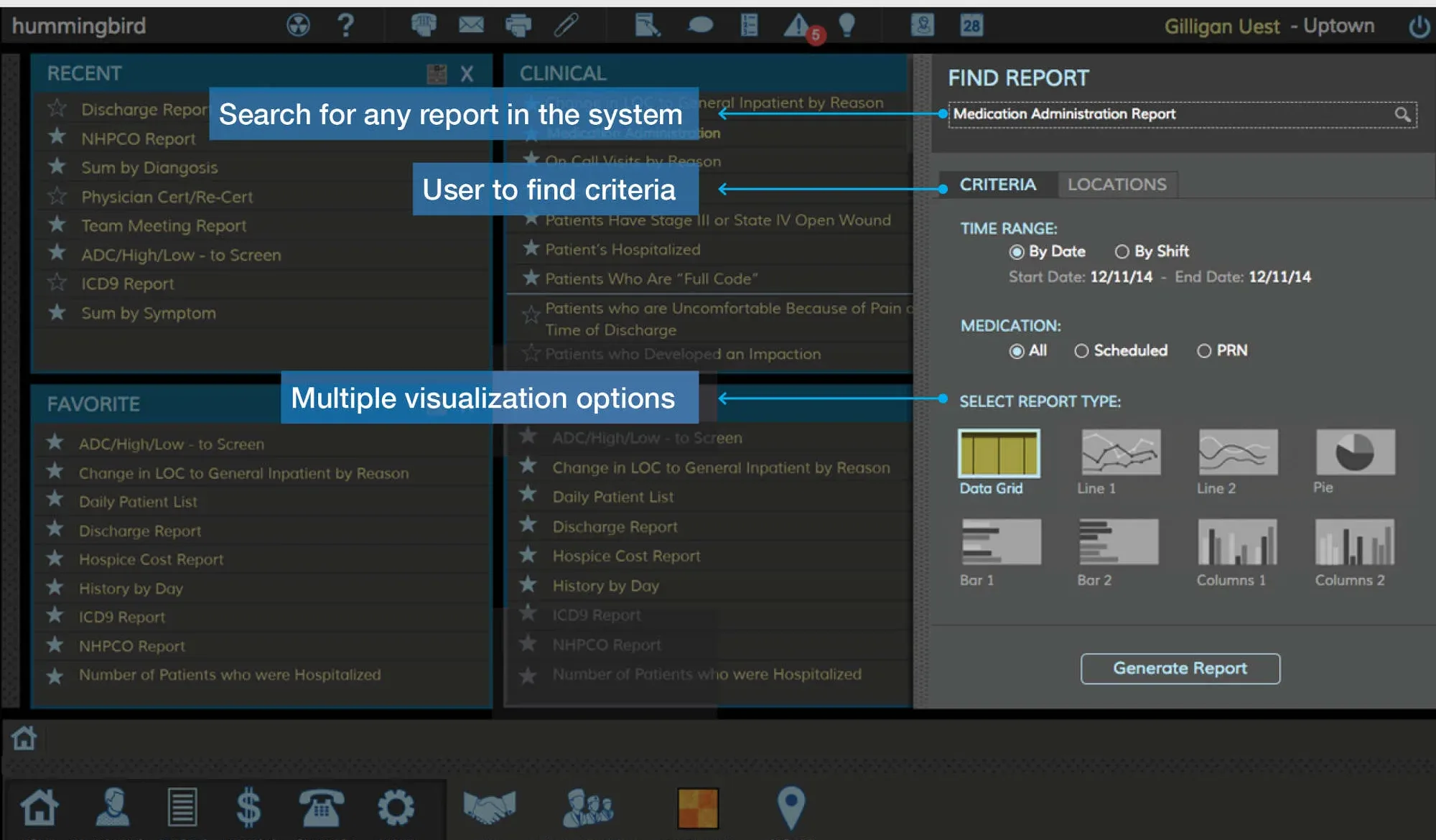
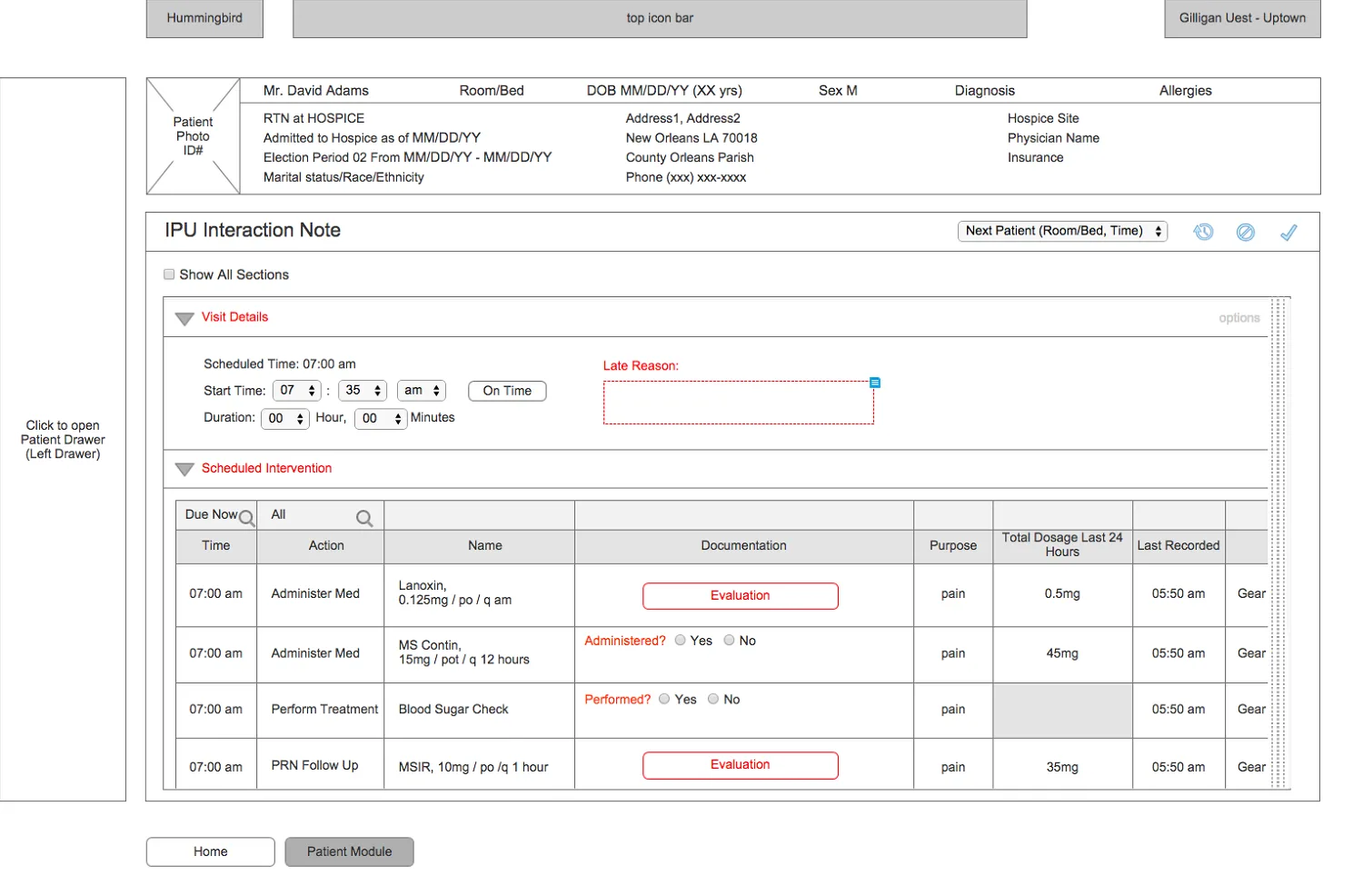
Hummingbird inpatient medication administration record: scheduled and as-needed interventions by time, an Administer Med dialog with an evaluation before the dose, and late interventions highlighted in red.Hummingbird interdisciplinary group meeting prep: a roster of patients sorted by priority and team member, with team selection, meeting time and member sign-in.Hummingbird recertification dialog inside a team meeting: eligibility statement, benefit periods, a physician’s narrative and a finger-drawn signature field.Hummingbird Find a Report panel: recent and favorite reports, search, criteria for time range and medication, and a choice of chart types before generating.The Hummingbird clinical dashboard in an alternate light color theme.Greyscale wireframe of an inpatient-unit interaction note with visit details and a table of scheduled interventions, each with an evaluation step.
Medication administration with an evaluation before every dose; meeting prep and recertification with a finger signature, so eligibility can be certified in the meeting itself; report search; the light theme; and the inpatient note wireframe.
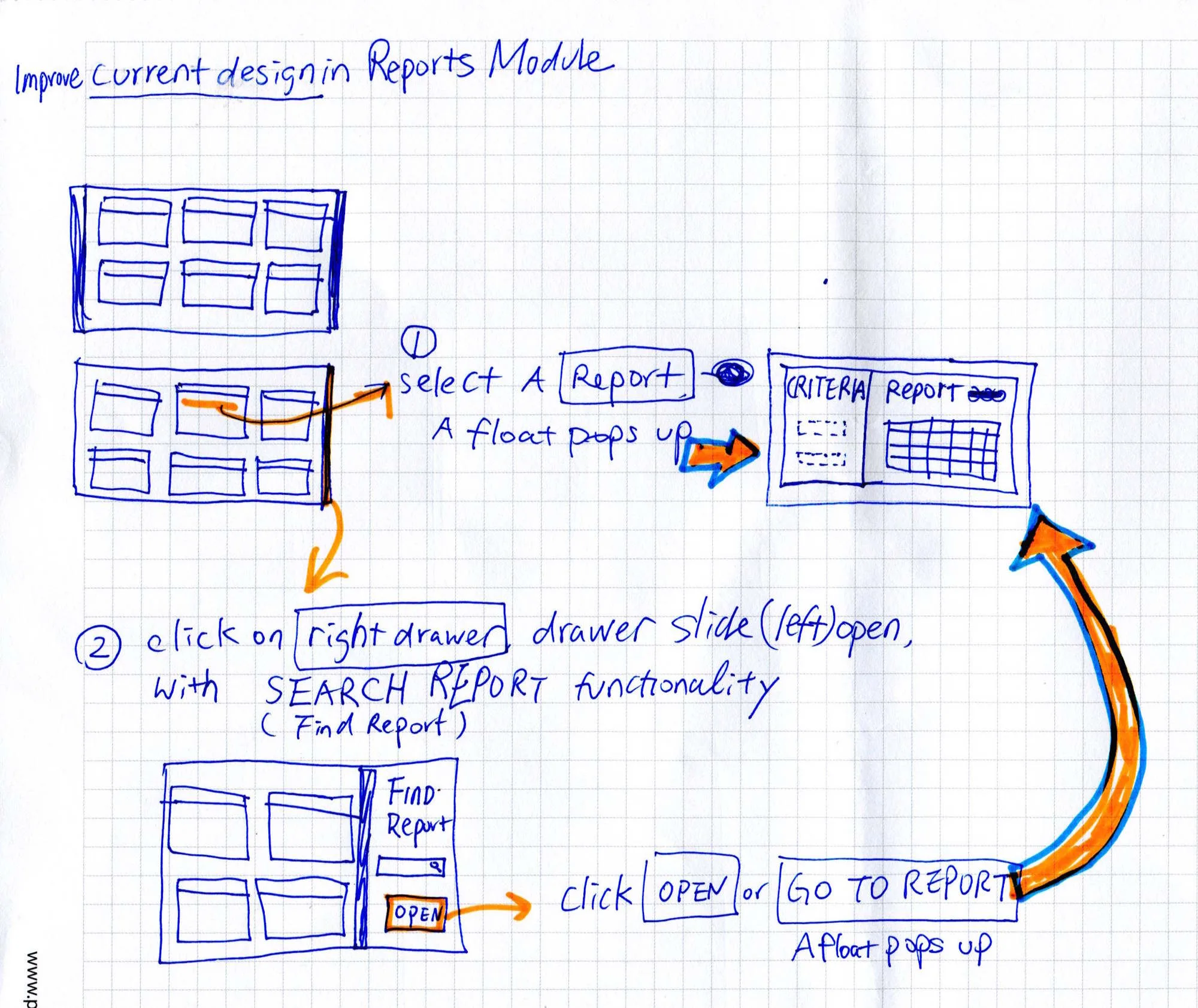
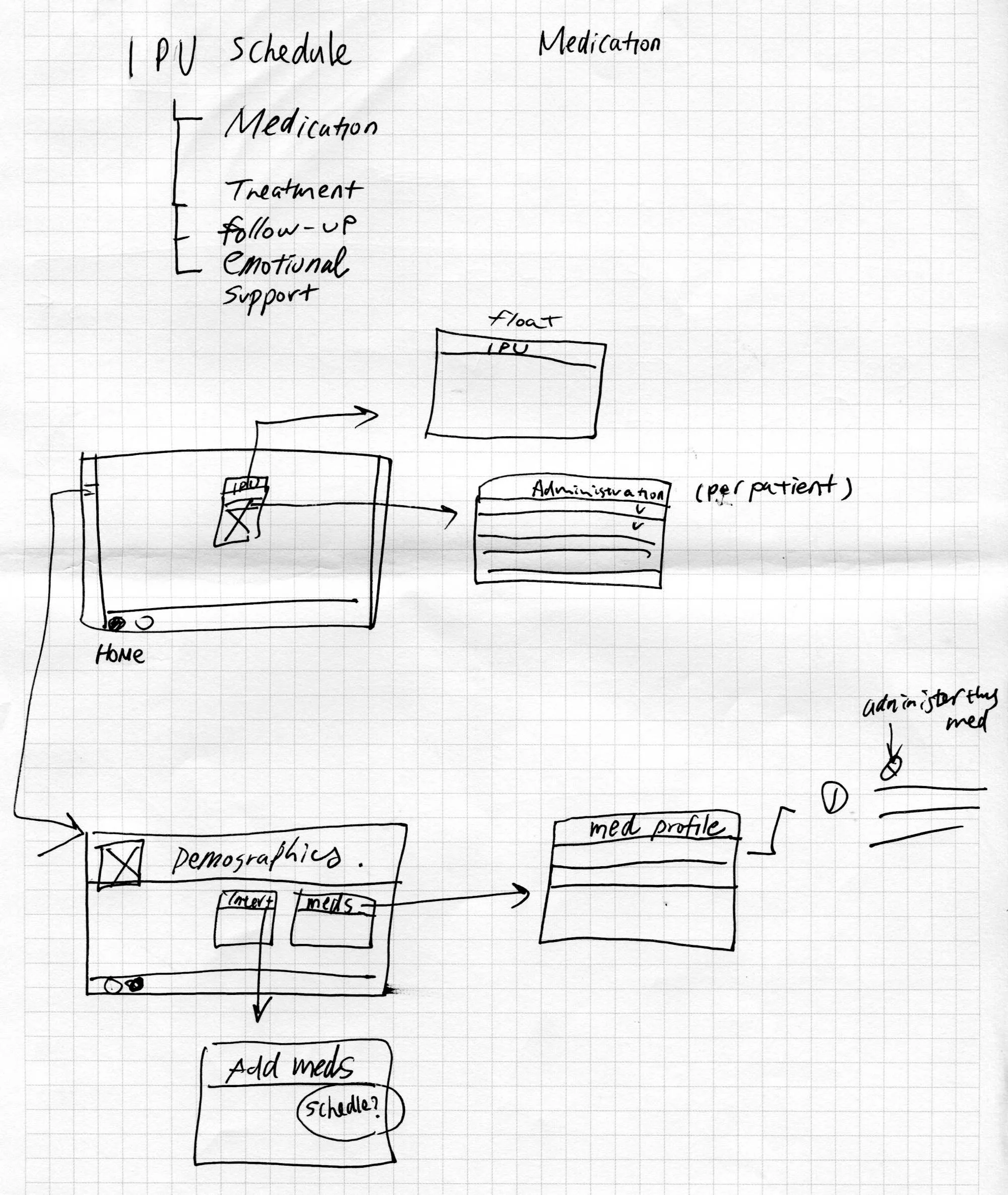
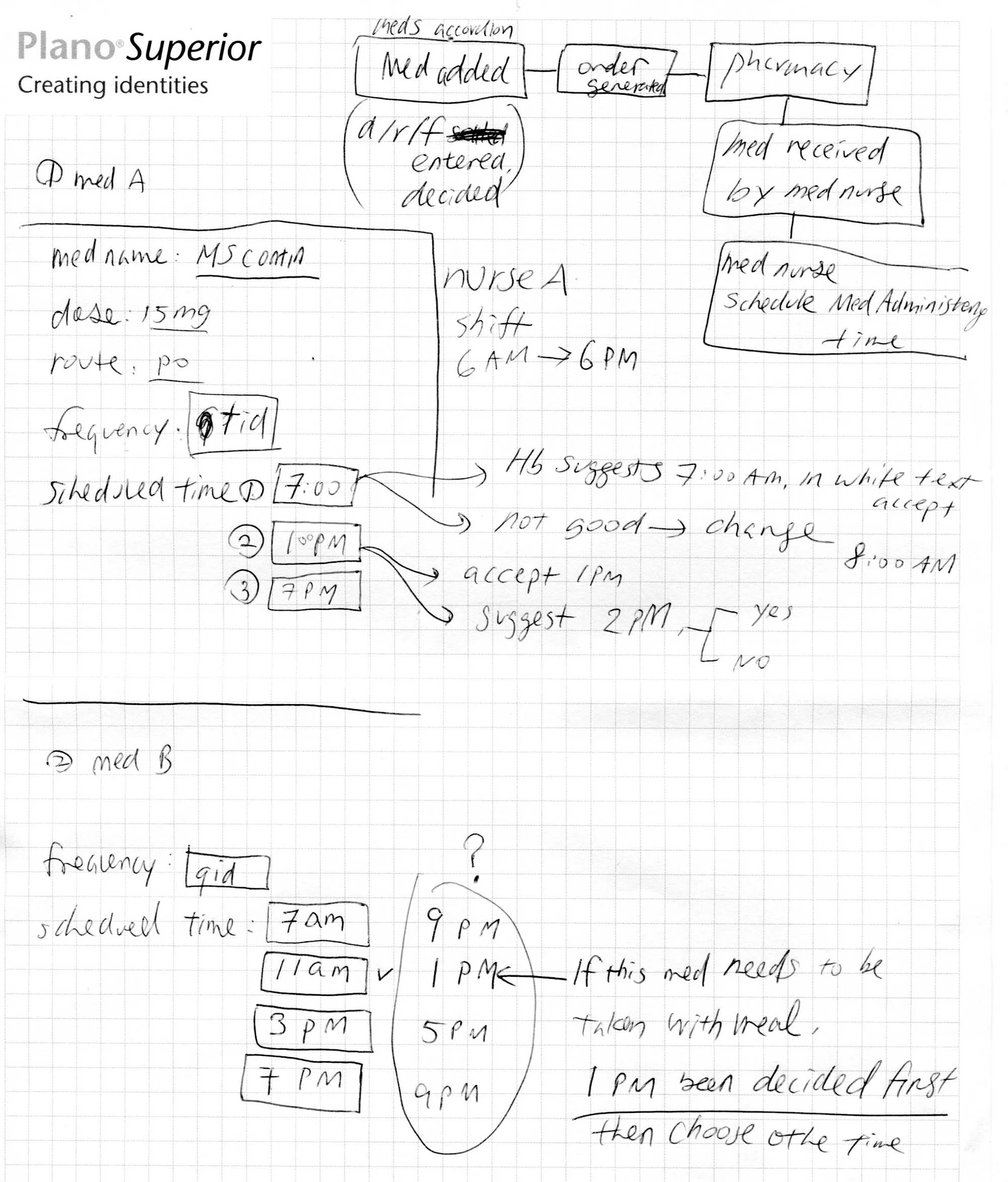
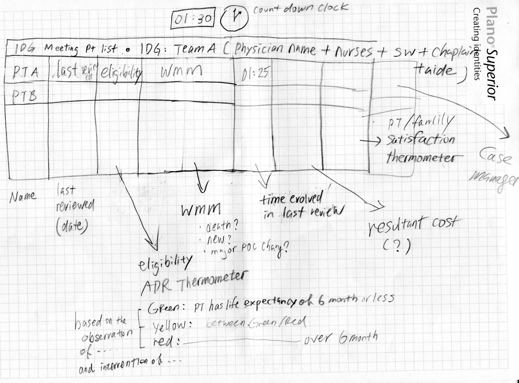
Pen sketch of the reports module flow: select a report, a criteria panel floats up, a right drawer slides open with search, then open or go to the report.Pen sketch mapping the inpatient-unit schedule to medication, treatment, follow-up and emotional-support screens, with a per-patient administration view.Pen sketch working out medication scheduling: dose, route and frequency for a medication, and how a suggested administration time adjusts when a nurse accepts or changes it.Pen sketch of the interdisciplinary meeting patient list: team, last reviewed date, eligibility, what matters most, and a green-yellow-red thermometer for life expectancy.
More of the paper trail: the report-search flow, the inpatient medication flow, medication scheduling rules, and the meeting list with its eligibility thermometer.
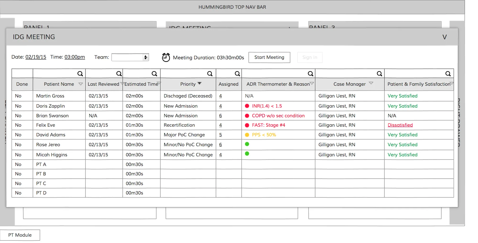
Greyscale wireframe of the interdisciplinary meeting roster: patients in rows with last reviewed date, estimated time, priority, assigned case manager and family-satisfaction status, with meeting duration and a start button.
Meeting roster wireframe: the whole team’s week in one table, sorted by who needs review first.

Outcome

  • A clickable prototype of the new Hummingbird experience became the company’s sales demo at major hospice conferences across the country — a modern product to show the market while engineering rebuilt the platform behind it
  • “What matters most” went from a design principle to the executive team’s experience strategy for the product
  • The clinical, operations, billing, and reporting modules shared one design language and one navigation for the first time

What I’d do differently

I designed from the inside of the company — executives, product experts, and the clinicians they brought me. I would get into the field earlier and more often: ride along on home visits, sit in on interdisciplinary group meetings, and test the prototype with nurses at the conferences themselves, not only in the demo booth.

What I carry forward

The clearest product strategy I have worked on fit in one sentence: start every visit with the question that matters most. I have looked for that sentence in every product since. In acquisition design it is the same discipline — find the one thing a person came to do, put it first, and let everything else organize around it.